Designing a landing page for onboarding schools to become part of BRI’s children savings program that led to 10% increase in visit, traffic & conversion rate
2018
Junio Smart is BRI’s academic and informative administration management for schools built to support the activities and needs for students to enjoy better. The program is part of BRI’s Junio savings program that encourages children learning the value and meaning of saving their pocket money for the future. The goal is to promote and educate future local schools about the benefits of integrating a system that is well connected, managed and empowers students.
Problem
The current E-form platform has been running for about 2 years and during its time it was only designed to notify availability spot in the branch office and the “booking mechanism” didn’t make a significant impact to the whole experience, thus confuses the customers when they found out that branch offices require to fill in the form again. There are three main category problems that impacted the overall experience of BRI E-Form:
1. Lack of system thinking and customer experience being implemented
2. Unclear vision of the product roadmap
3. Long and painful layout form design that prevents user to fill
Challenge
How to obtain new customers through storytelling instead of hard sell? Junio Smart has a limited budget to try obtaining customers for joining the program and they require a bridging between customers and BRI itself. With a constraint time and delivery for showcasing to stakeholders, the design can only showcase main selling points without enabling customers to mover around too much across the website.
The MVP that we established as an area of focus are:
1. Strong storytelling about the product and the impact it provides
2. 1 - 3x scroll for efficient information capture
3. Clear and concise information, contact and registration
Project Role
I’m the ux and ui designer and overseeing support from illustrator providing the illustrations and also Conduct research, competitive analysis and testing to current users
Users & Audience
Children / Students: 5 - 16 years old and Parents/Teachers: 28 - 45 years old with a strong technological exposure or tech - savy who enjoys learning together and strong belief in education as part of your growth.
Design Principles
My principles have always been: Customer first, Storytelling, Impactful and Simple. The product needs to be customer first minded catering to their needs. The product needs to connect users through a story they can relate to. The product needs to be impactful for both users and the business. The product needs to be simple enough to use for longetivity.
Briefing Process
We conduct a user interview with stakeholders on the beneficial requirements that needs to be done and achieve in the site. The stakeholders briefed us about the vision of the product to become the standard finance x education system in public schools using BRI as their financial management. However, as a technical team, they require support in bridging their product to potential customers or whoever is accessing the site. The specific task that we require to work on is designing a site that would bridge customers but also invites users to be part of the program.
Figure 1.2 Users Description
Ideation Process
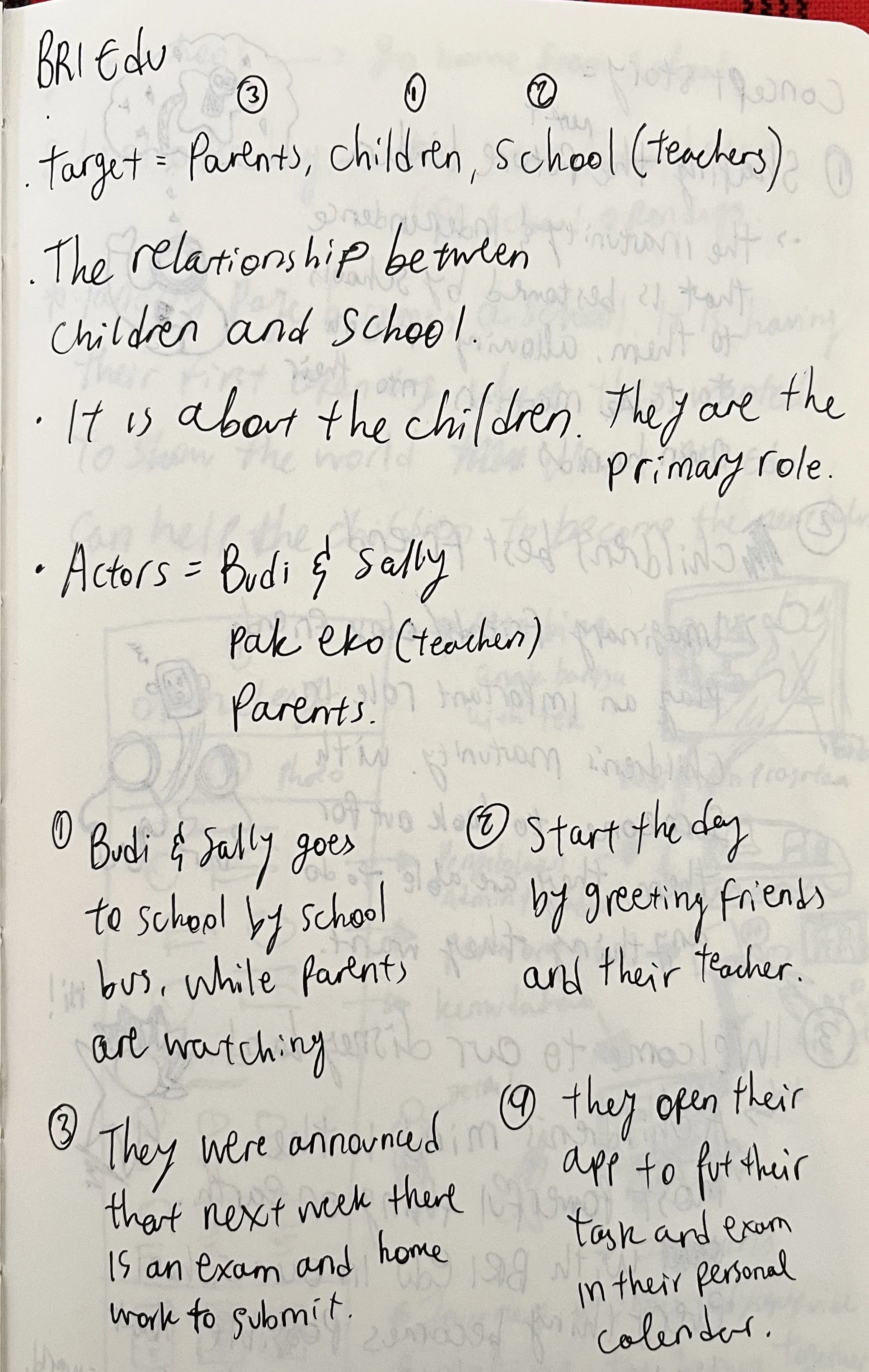
Once the requirements have been given to us, the next question is where to start? We need to undertake and gain a better understanding of why the product is special and how might this product benefit the users around them. We started of drafting some ideas and notes on how we should approach this task.
The first step we did in this ideation process is to identify who are the actors of this product and who are going to visit the site. Developing a short story for each actors help us identify how might each users will explore or approach the site in different settings. To make the design process easier for us, we establish a goal for designing this landing page is:
“ Building a safe and connected ecosystem within the education system, as well as building a safe and interconnected relationship amongst them, with the children being as the focus in mind. ”
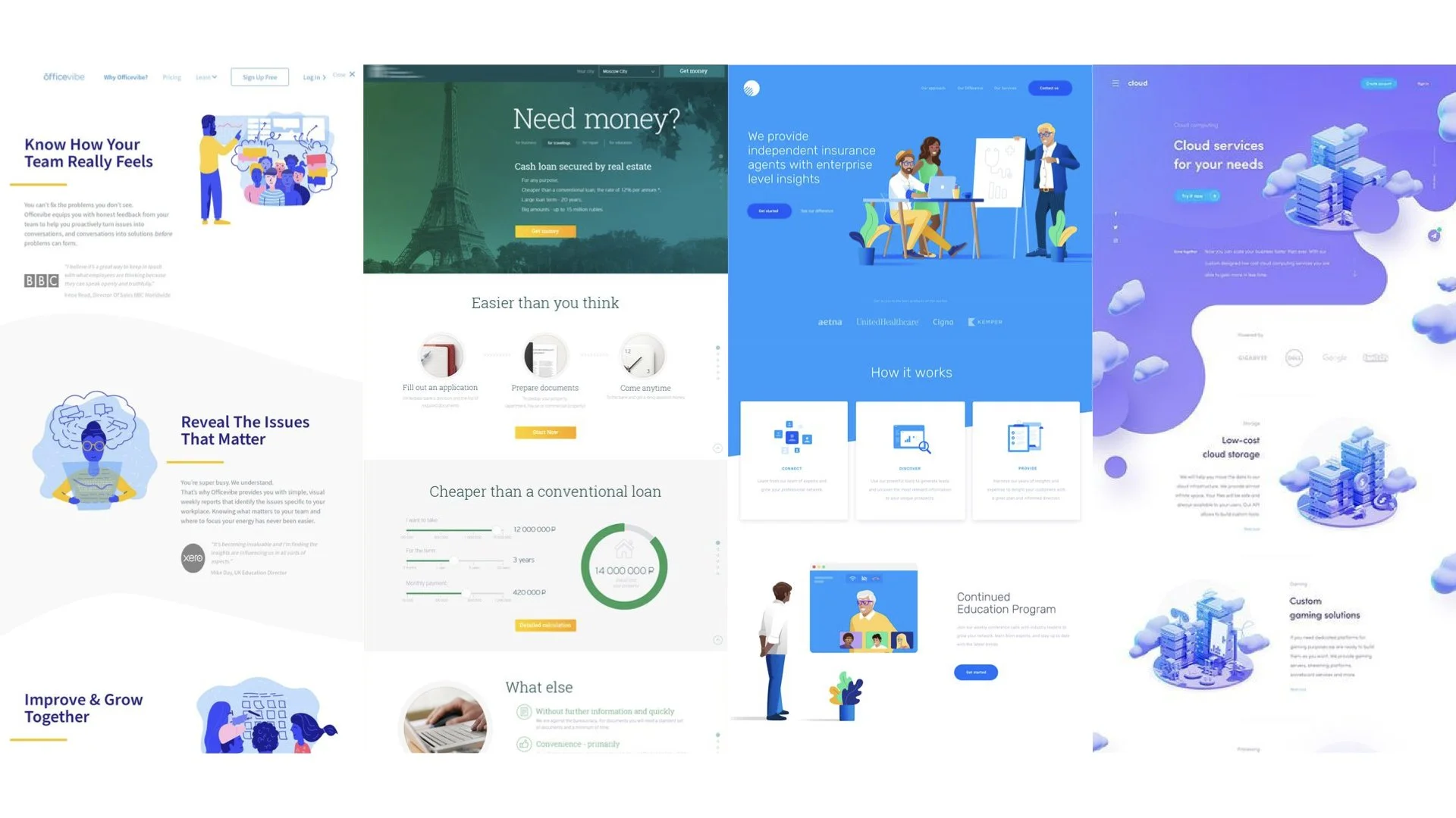
Hand Drawn, Photo Realistic, Full Color, Gradient
We then looked at some references of what kind of vibe and essence we wanted to bring to the landing page. After looking through different existing designs, concepts and real live landing pages; we benchmarked in four different styles to show the stakeholders which one suits the BRI brand image and appropriately communicates to the users.
In this process, we decided to go from identifying potential customers and straight to competitor referencing because of the timeline that was given and the goal is still focused on design oriented on how can we display all benefits to convince the readers of the landing page. As our first experience in designing a properly functioned landing page, we wanted to focus on storytelling the whole product alongside their benefits and contextual placement. We believe story-telling is key to onboard users successfully.
Design Process
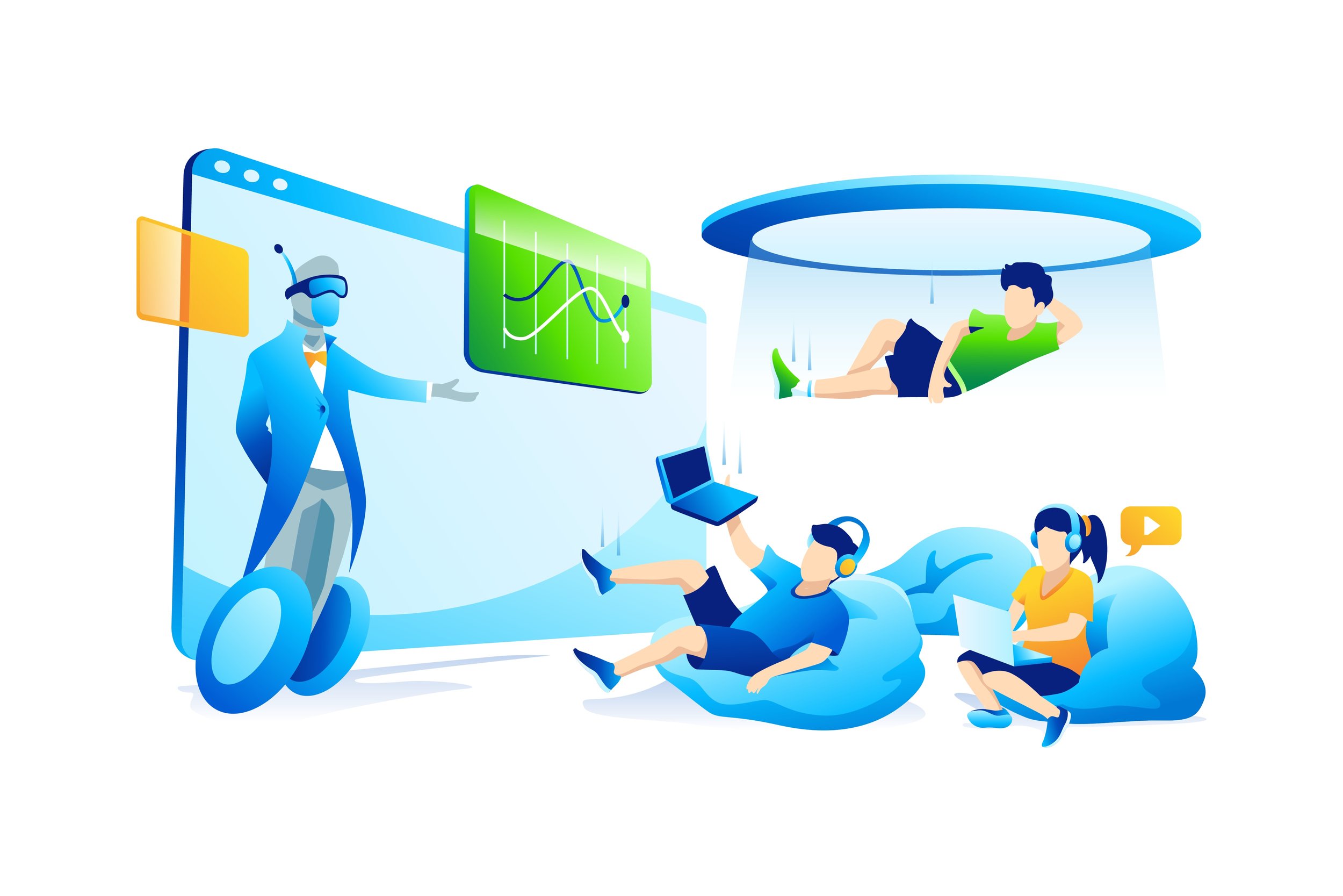
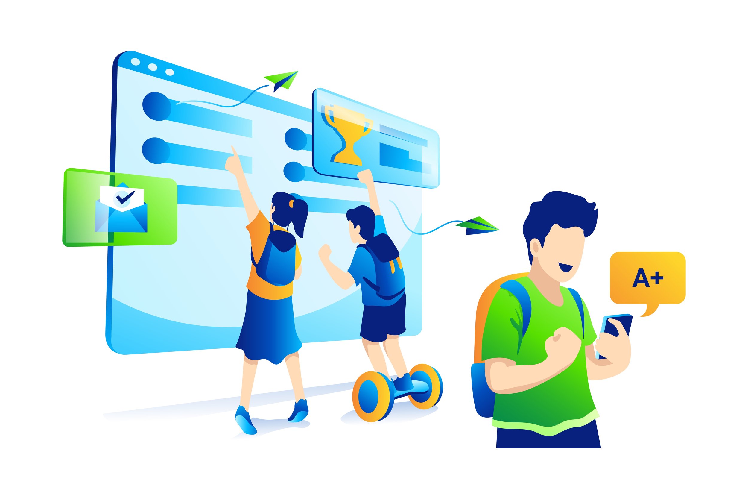
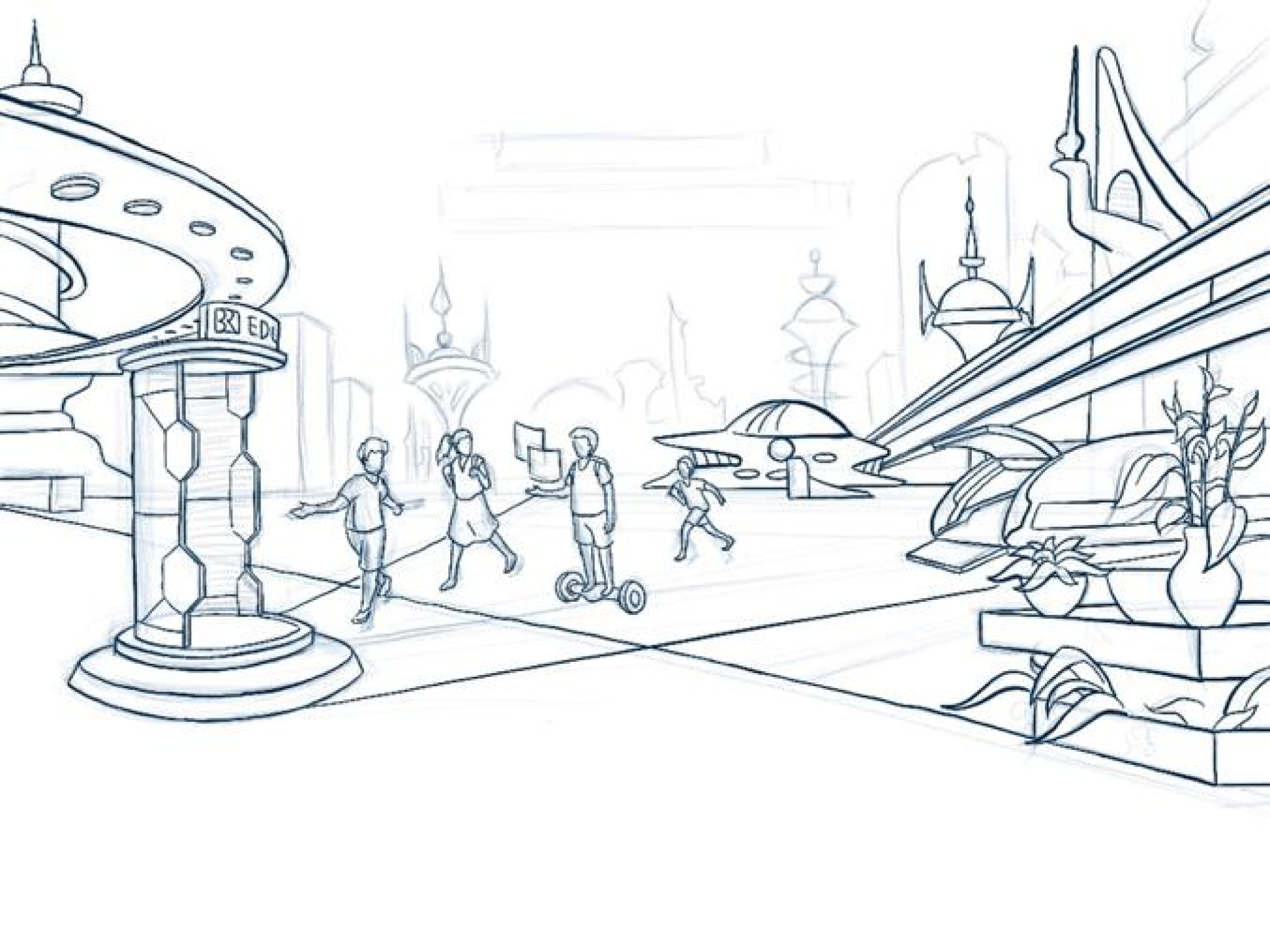
The next phase of the process is establishing a concept story and wireframe sketch for the product. We explored three different story concepts to illustrate the whole site. We went with “welcome to disney land” concept story where we wanted to focus on the children’s imagination and focuses on children as the main characters that would represent the product. We also wanted to tell a story that with this education platform, everything is possible to make the futuristic world a reality.
We explored different ideas on how to compensate basic layout with seamless story. We wanted to illustrate all simple school activities into a futuristic themed scenes. One of the aspects we wanted to focus on is how to persuade and lead users to read from the top section of the site and scroll all the way to the bottom completing all informational product benefits that has been laid out. In order to make the concepts more lively and compelled, we collaborated with an illustrator that can help us bring the idea to life.
Collaborating with the illustrator has been a fun experience because we get to share many ideas and approaches on how we wanted the site to look like. I get to share the direction that we wanted which is more of a story telling structure with a mix of full color and photo-based to give a sense of the relationship between all actors and the illustrator gave his vision and stylistic approaches on how to portray modernism while maintaining the fun outlook of the design.
Once the art direction has been defined, the illustrator contributes its specified sketches to encompasses the whole theme, we asked the illustrator to focus on: Header, Main Selling Points, Benefits and Join Us. The challenge of collaborating with the illustrator is how to make the rest of the items correlate with the color and tone of the characters that are being portrayed in the website.
Final Design
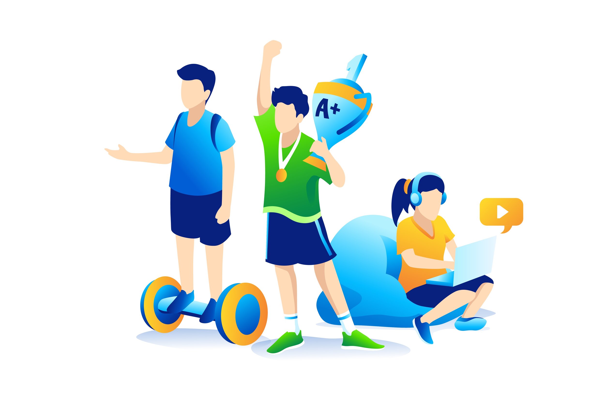
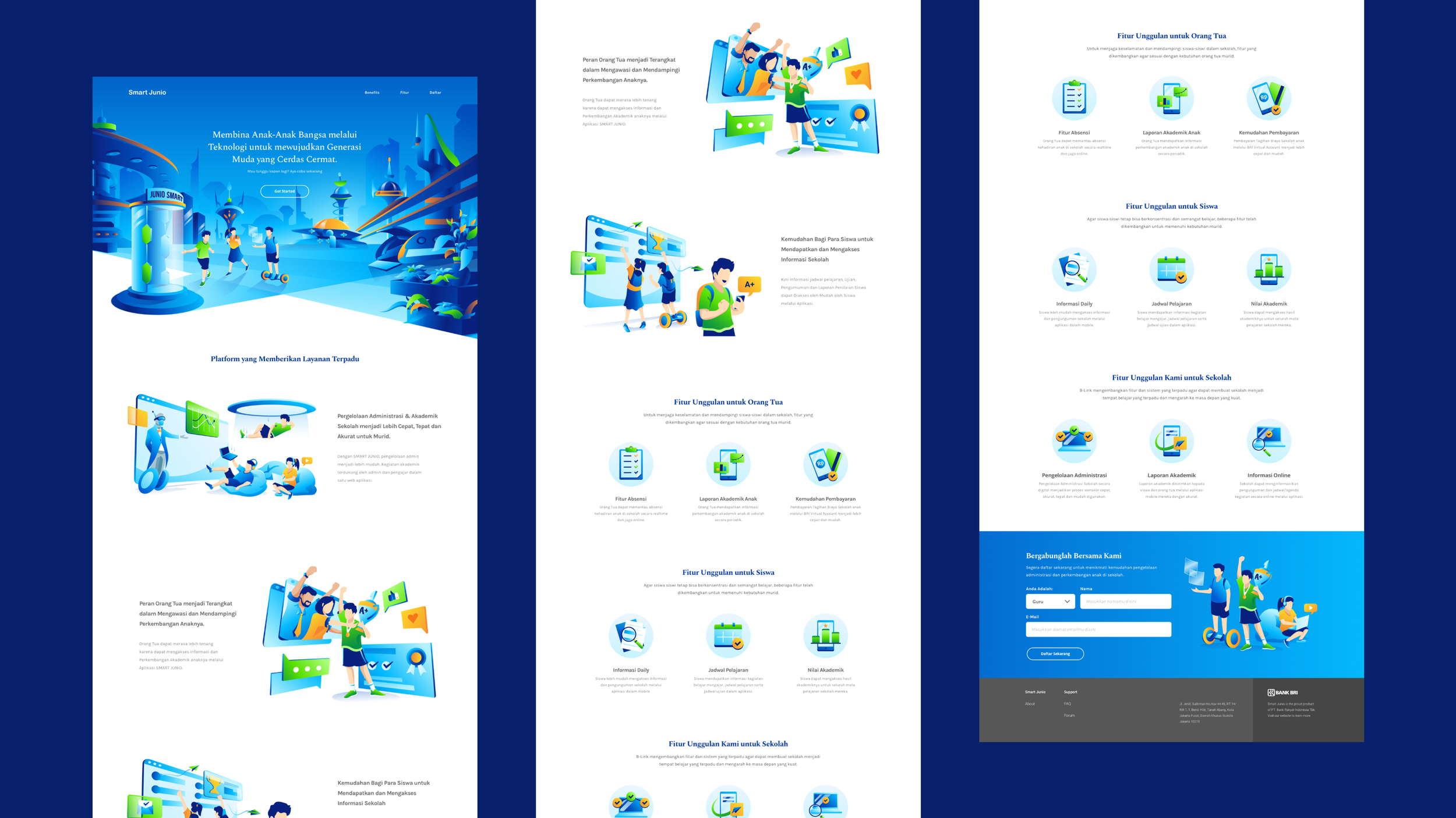
The final landing page looks modern, colorful and mature at the same breathe. The story here takes place of three children who seek to pursue knowledge in a world that Junio Smart has defined. Taking place in the future, the three children explores a world like no other. They enter a portal gate where they are about to embark on a journey of learning this world. This part illustrates how we wanted to grab users attention just like the students and while exploring the landing page, it feels like they are brought along into the journey. In the final design, we took out the photograph image because it felt that it didn’t match the whole theme and story of exploration and to keep the theme in consistent. The journey of reading continues to all the benefits of what Junio Smart has to offer and finally a section dedicated to join us while illustrating the achievements of the children or what the future holds as they have completed from school.
Results & Key Learnings
Since its deployment, from what I can share is that we have obtained roughly about 1000 users visit, 100 users have registered and 10 schools have joined the program in the first quarter. Although this shows 10% in increase and added to BRI profile, it still considered to be low as it can be expected.
There are lots of areas that can still be improved in design process and strategy thinking. For one, the landing page can be shorten and simplified so that we can focus on saving users time. Also, adding more CTAs that would influence users to read more is also necessary for future development. We should reevaluate again if the landing page requires more focus on capturing users or simply to educate. According to web design 101, we should reshuffle the focus to pay attention more at product positioning and brand statement while also looking at what do users expect in the educational environment. Reflecting back on how we have designed the landing page; there are some considerations we should undertake:
1. Although we have delivered the landing page as a UI assets, it would be great in the next step to see if we are actually converting or users dropped off after visiting the site to see if the landing page has actually contributed to the business model.
2. Although we managed to do quick test with the stakeholders and some BRI employees, it would be great to see how the actual users (in this case kids) actually responded since the focus is to obtain schools, parents and children.


