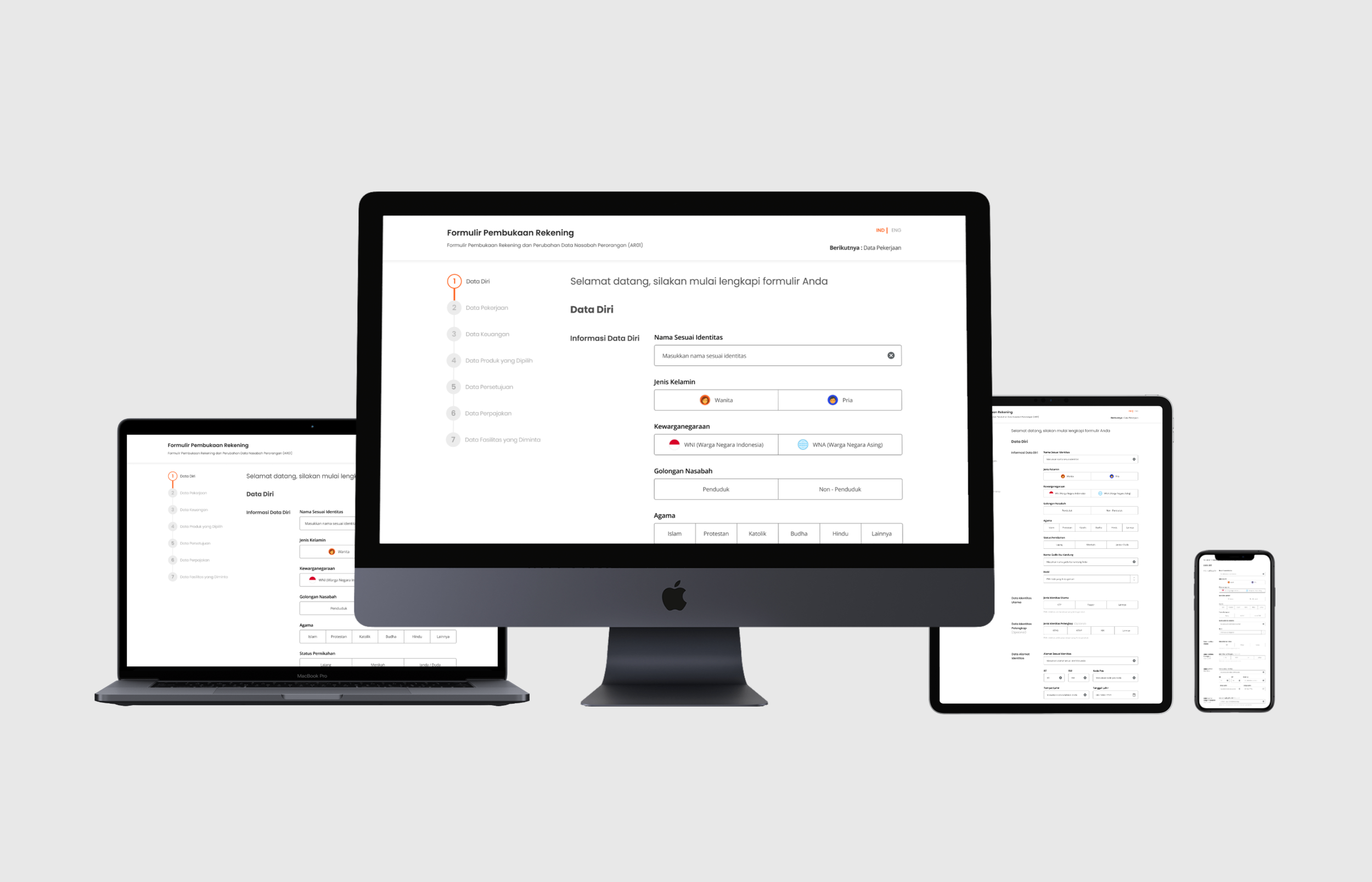
Reinventing the existing banking electronic forms for better seamless experience in form filling through a digital landscape.
2020
BRI E-Form is a multi-purpose electronic form platform that functions as a system for any customer services. Originally, it started as a physical form that customers need to fill. However, overtime the demand for express service has increase from customers. The goal of this project is to reinvent the experience of filling physical forms into the digital landscape, without compromising compliance and regulations, as well as fitting the niche of the market.
Problem
The current E-form platform has been running for about 2 years and during its time it was only designed to notify availability spot in the branch office and the “booking mechanism” didn’t make a significant impact to the whole experience, thus confuses the customers when they found out that branch offices require to fill in the form again. There are three main category problems that impacted the overall experience of BRI E-Form:
1. Lack of system thinking and customer experience being implemented
2. Unclear vision of the product roadmap
3. Long and painful layout form design that prevents user to fill
Problem
1. I had the opportunity to become the lead designer for this project, while having full design decision making through collaborating with developers and vendors.
2. Designed the first concept for the moonshot platform.
3. Job description working as a facilitator for design thinking session, research discovery, oversee support from junior designers and usability testing.
Challenge
How to simplify the form filling experience that motivates users to fill through the web than in physical form? Heavy regulations and compliances may affect the total experience of the product and in this case we need to find the right balance between customer and business needs without affecting and compromising the product experience. It is also important to consider the total experience of eform plays a role on the customer satisfaction in which it enables customers to achieve their goal.
The MVP that we established as an area of focus are:
1. Creating an experience that will distract user from thinking its a long process
2. Steps simplification while able to track and record proper data
3. Clear and concise steps of completion than previous design
Users & Audience
26 - 45 years old customers who desires to open a new account with BRI and for returning customers who would need to run their banking errands quickly. It also applies to non-tech savy customers who need to go to the branch.
Design Principles
My principles have always been: Customer first, Storytelling, Impactful and Simple. The product needs to be customer first minded catering to their needs. The product needs to connect users through a story they can relate to. The product needs to be impactful for both users and the business. The product needs to be simple enough to use for longetivity.
Research
In this project, we kick off with briefing from the stakeholder and product owner sharing to us that the goal of this project is redesigning the existing eform site and redefine the banking form system end to end. While it may sounded simple, there are lots of things needed to be considered such as how will the total experience compensates a new user experience of using the form digitally and how will the customer experience be presented once it reaches to customers and the bank’s branch. The stakeholder presents us with a draft of the new eform scheme to give us an idea of how they wanted the eform system to run. They also briefed us that in this new eform, they wanted the physical bank form’s content to be digitised in the new eform because they wanted to improve content management consistently so that their data will be properly moderated.
“ The BRI forms have lost its purpose in functionality and usability to both customers and business. The Eform should serve as a bridge between customers and the service of the bank. ”
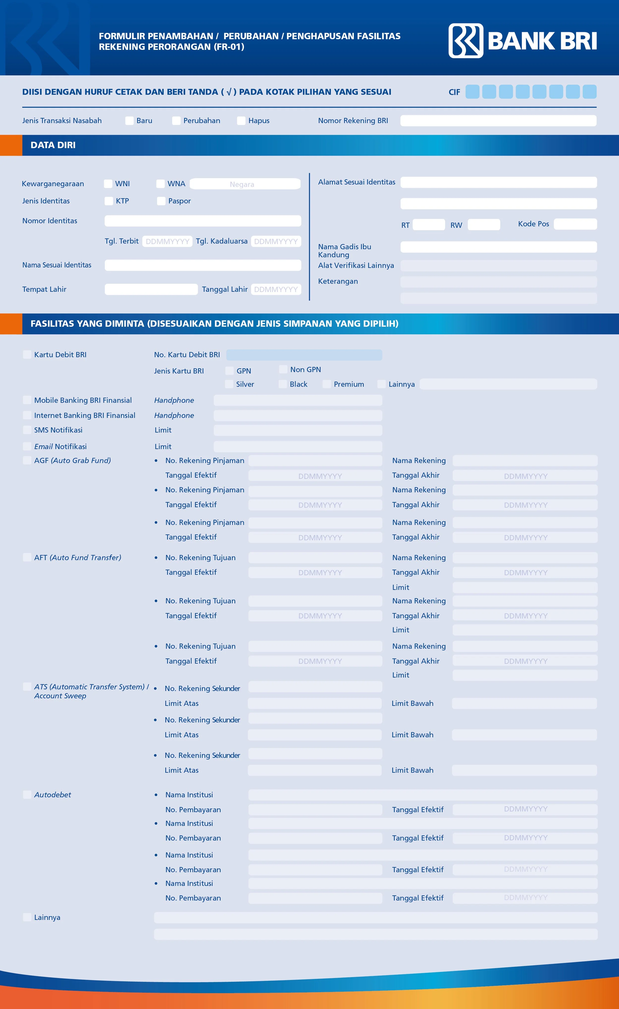
We started conducting the research in three approaches. The first approach is visiting the main bank’s branch to get a better understanding of the environment and to obtain the physical forms that were presented for the customers. While analysing the physical forms, we also converse with the employees who worked at the counter to get information. They all shared to us that all physical forms as of late were not handed to customers anymore and were provided by the employees when customers wanted to get service because they were trying to reduce the time spent for customers to write down their forms. Customers also complains because there were too many requirements in a long formatted form and therefore creates a feeling of dissatisfaction of filling the presented form.
In parallel of conducting observation and interview research, we also did a heuristic evaluation on the existing form so that we are able to study how might user interact with the eform and what are they feeling when filling out the forms along the way. In this evaluation we invited 5 participants from different backgrounds to try completing a specific task in this eform and for this task we instruct them to try opening an account.
As it turns out, most of the options that you do in eform were not focused on the activity of opening an account or change a data, but rather it is actually to book a time and cue number for the customer to come into the branch and perform the task at the site. We also realised that customers don’t have the flexibility to choose any branches to visit other than the branches near their registered location. Having noticed this, we realised this can affect trust and communication to customers who are going to use the eform.
We also did a competitor analysis to compare the existing eform with other bank’s eforms while matching the insights from customers to further strengthen the result. We compared to other competitors with the likes of Mandiri, BNI, BCA and DBS since we consider these four banks have utilised the eform system well. We found out that Mandiri and BNI has the eform system seperate to the products in their respective website considering it as a standalone platform; whereas DBS and BCA has made it an integral feature and part of the main bank’s site ecosystem. This shows that BCA and DBS considers eform as a bridge between the customer’s onboarding towards the end of the activity. With this approach its easier for customers to gain a better understanding of the next step. In a nutshell, rather than asking customers to open a new account from the eform, we would simply reroute them to open an account from the main website giving them freedom and option to choose and then direct them to the eform system.
This research process is a new experience to us because we got to look at the product from different perspectives and it turns out that everything is connected. As I thought the task of redesigning the site and redefining the user experience of the platform would already be a simple task, turns out there are other things that requires attention in order to redefine the product goal and definition in the long run. As a product designer, we should be able to approach and tap on these untouched areas in order to make the product even better.
Ideation
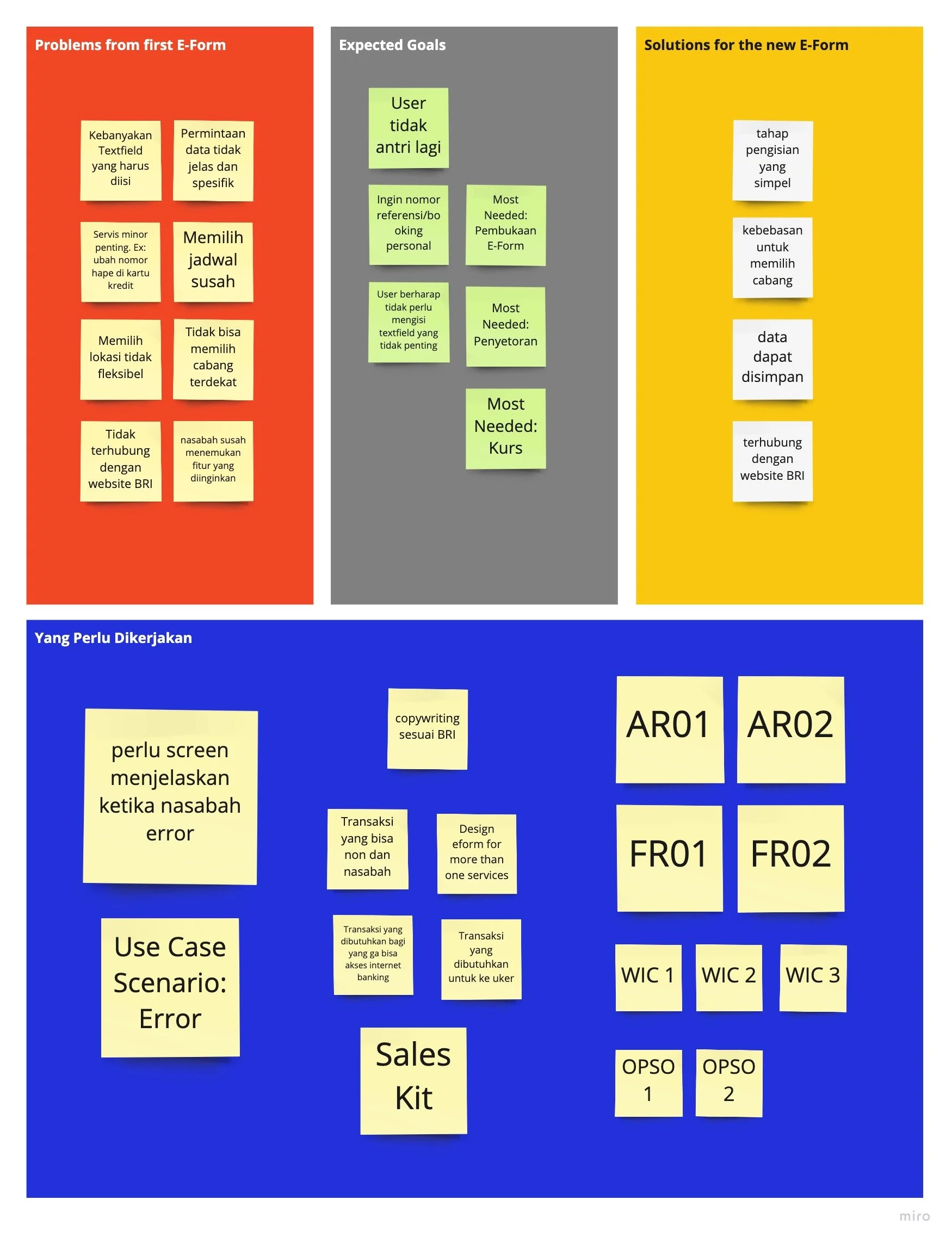
We presented the research results to our stakeholders and also the recorded evidence from the tests and evaluations to give the customers point of view from trying out the eform site. We wanted to show every single evidence because we wanted the stakeholders to get on board and also starting to apply customer centric mindset when we are creating the platform. To sum up what we have discovered, we have learned that:
1. The eform requires a product definition to determine weather it should be a standalone platform or becoming an integral part of the bridge between customers to the product via the BRI website.
2. There are unecessary information requirement that customers require to fill in because eventually the counter employees will be filling it in.
3. It functions as a booking system but once customers have arrive in the branch, they still require to cue in a long line thinking they would’ve got a priority lineup.
4. The eform is presented to look tedious making the customers have no interest in completing their actual task
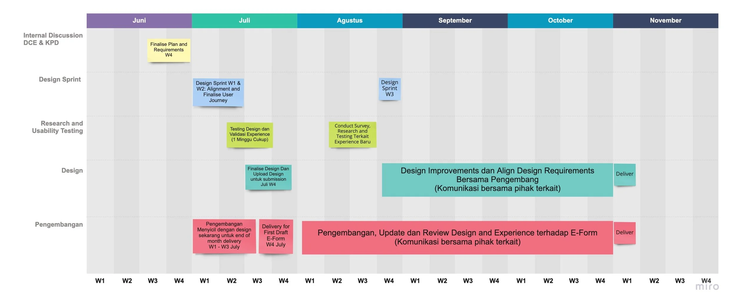
Once we have all agreed that there are four point that all of the team should consider, we then proceed on building a timeline together and decide on the scope of work in each quarters for every role’s task.
Based on the timeline we have agreed on, the design team will require to deliver a redesign of UI and UX for the eform site while also provide a customer journey blueprint as a future document for when the stakeholder decides to continue and focuses on the total experience of the product. The reason to firstly focus on the development on the site for the first year is because the product team believes that fixing the system would be more sufficient than to approach head on as well with the rest of the experience. Having said that, we need to digitize and transfer all physical form content into the new eform system.
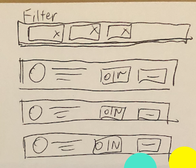
In this ideation process, not only we did a decision jam activity for features prioritization but we also did a quick crazy 8’s exploration on creating ideas for a new homepage, search engine and features categorization since eform is still in need to bridge between customers and the bank. We conducted a very simple and straightforward planning because for the first initial stage; the product and design team would require a strong collaboration first whereas the development team will start with the design once everything is all set and aligned. We didn’t use lots of framework methodology in this part because most of the materials are also prepared by the stakeholders as we need is to diverge the insights with our key findings from the research.
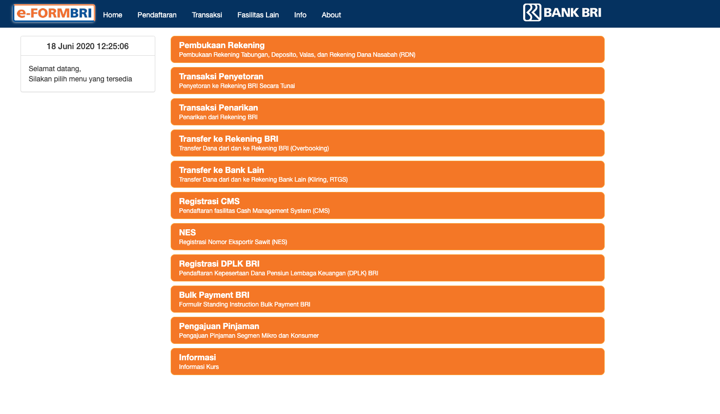
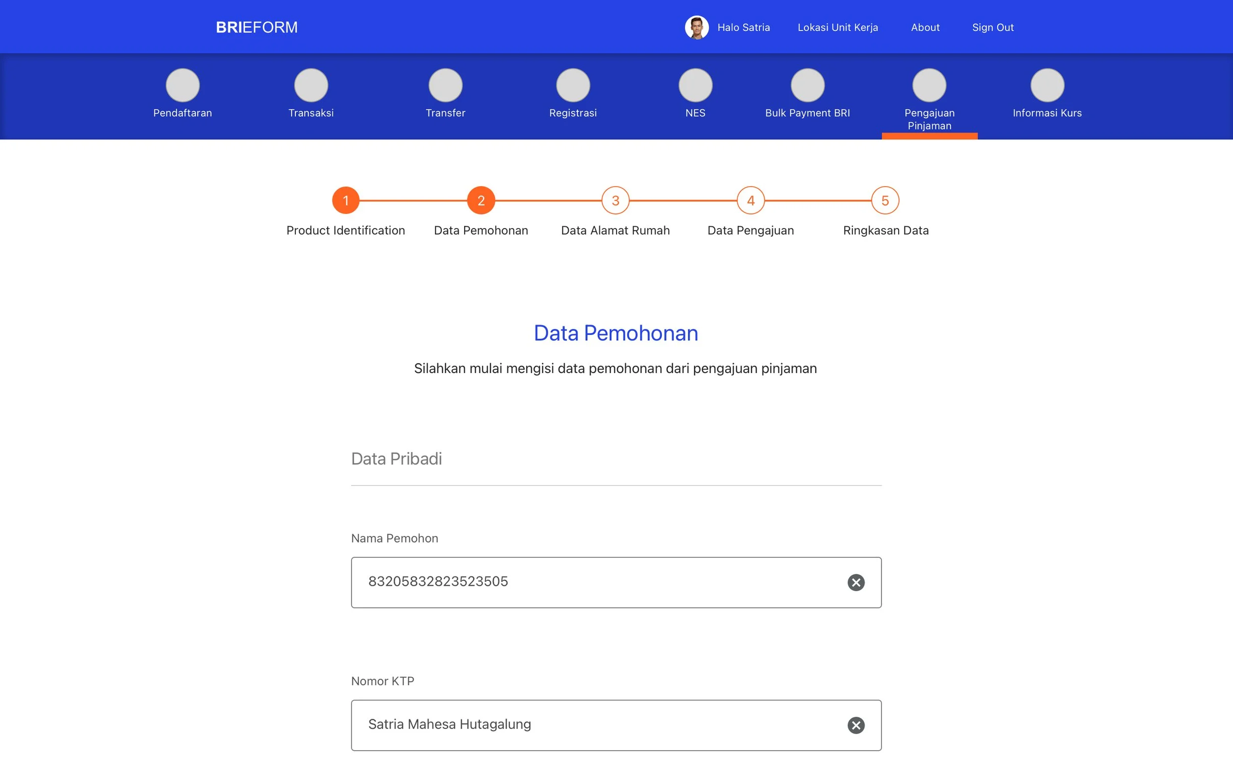
Existing Design
Design
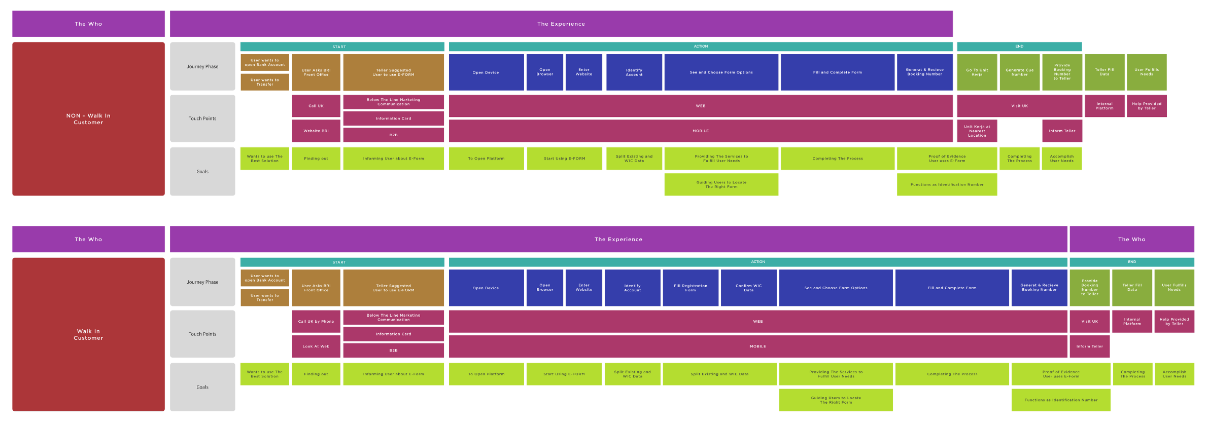
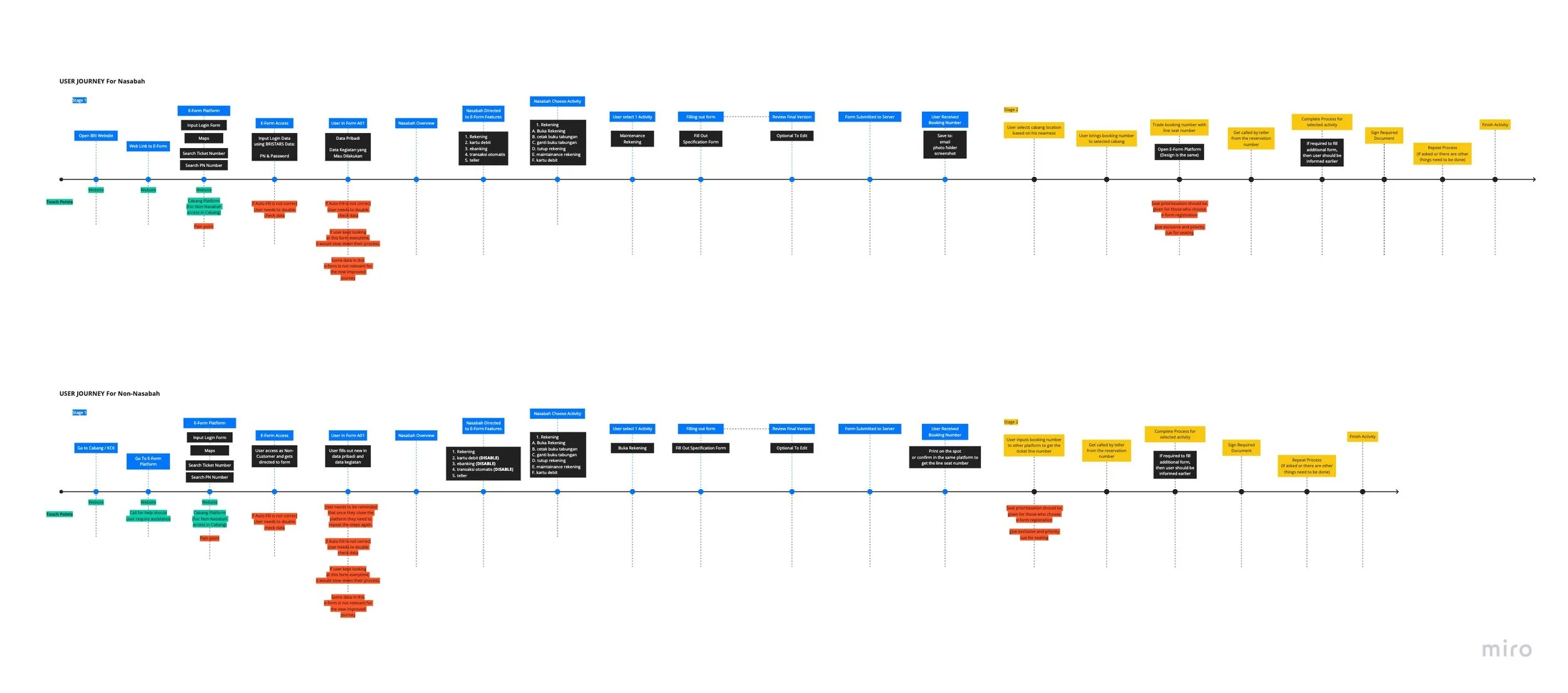
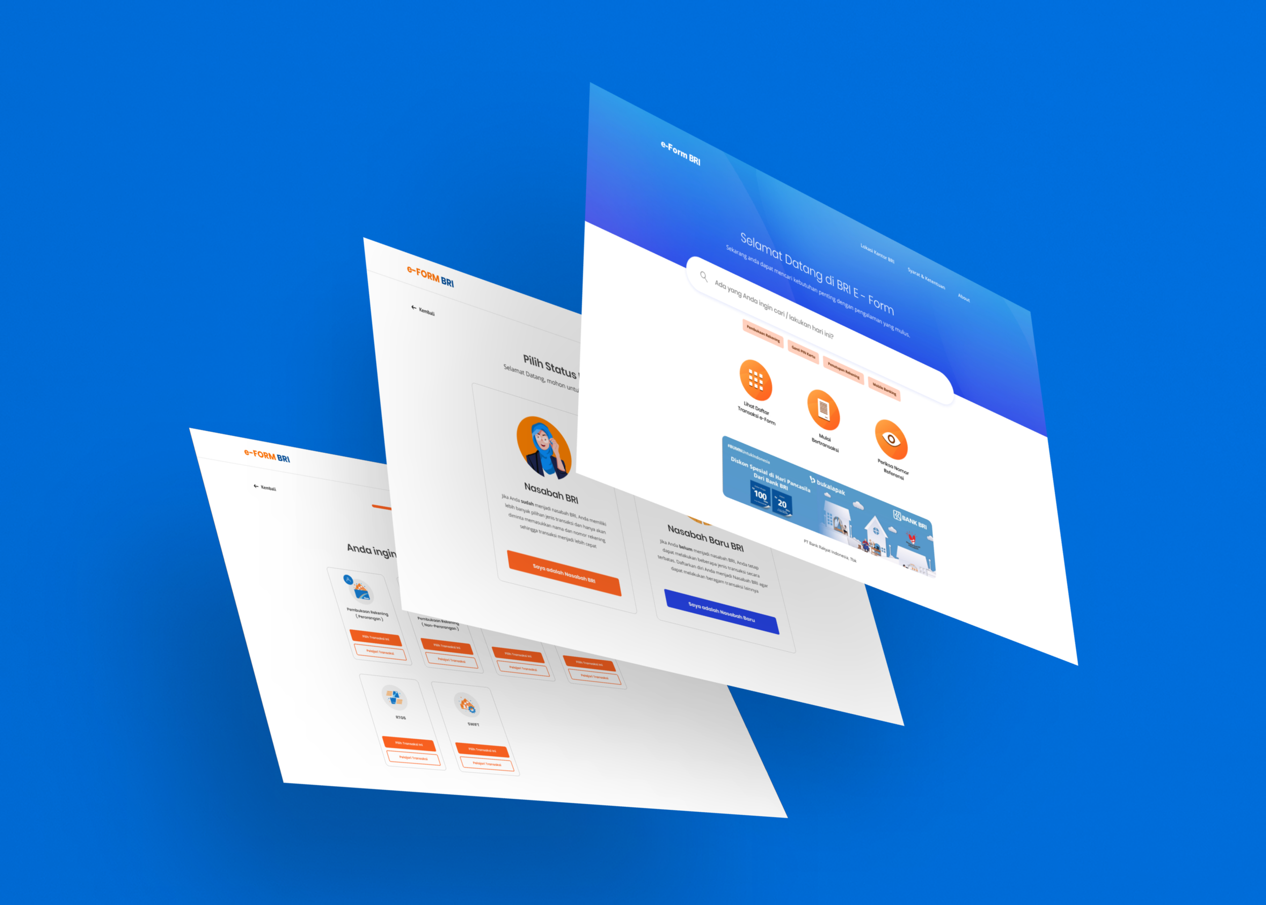
In this design process we started off with an information architecture map provided by the product owner and along the way we discussed on how should the experience should start in the beginning. We created for different touch points from employees, customers, the product team who maintains the server and the machine that is going to be placed in the branch.
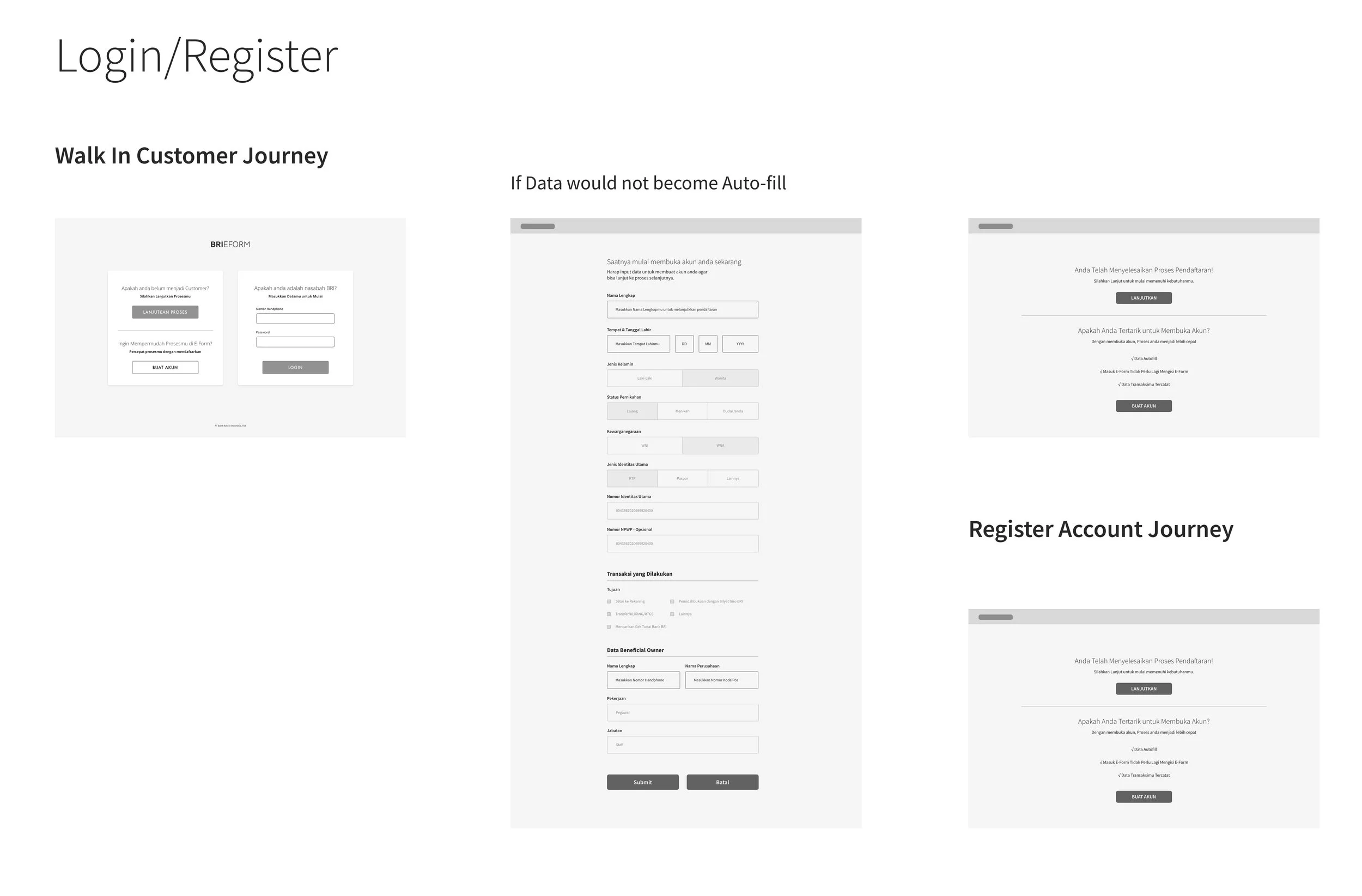
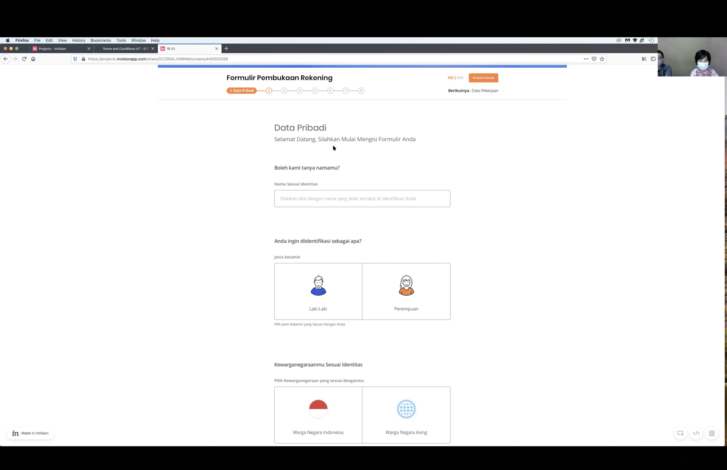
One of the things that were highlighted is that while customers wanted to immediately fill in the form, the product owner requires the eform to start by asking the user are they an existing or a new customer. The reason for this is because the product team would need to record and track customers journey path for data collection and also because the eform has seperated different contents for new and existing.
Another main point the product owner requires us to maintain in the new improved experience is keep sustaining the long requirement content of the form. As a design team, we kept challenging on the fact that inputing datas in the eform requires simplicity and efficiency. Based on the customer needs, they wanted a simpler format. However, due to prioritizing data collection and maintain regulations, the product owner insists on still maintaining every single content being digitize. This puts us in a position to challenge ourselves how might we improve slow and distracted time for customers so that they won’t feel that inputing the eform felt very long.
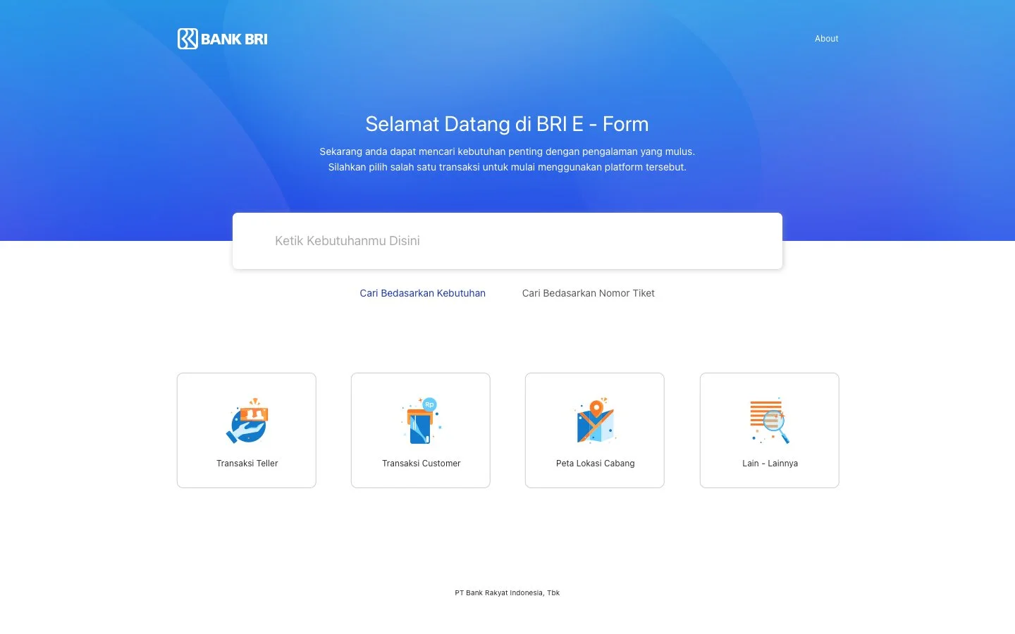
Lo - Fidelity Wireframe Explorations
Version 1 Explorations
Version 2 Explorations
Version 3 Explorations
Version 4 Explorations
We aligned every single points of the journey that is still required from the bank’s compliances, while trying to establish an improved user experience in the eform. We started off with low fidelity and made our way to establishing a high fidelity design. The goal for this design process is to establish a template or structure that would allow us to replicate easily when we are about to work on the remaining form designs. In a way, we planned early to build a style guide in order for us to work efficiently since most of the time we will be working on the detailing of copywriting.
Usability Testing
We then conducted usability testing to validate whether the design has solved the big problem and the customer needs as well. A rough prototype has been designed with crucial points and finally getting the prototype in usability testing for finalize before handing over to the development team.
Although the stakeholders didn’t ask to be tested, it is upon my initiative to give the prototype a test so that we are able to anticipate what works or not. This gives us the opportunity to retrospect on areas or features we can we improve during the development and what can be placed in backlog. We always ensure before development we provide a test immediately before handing it off in order to avoid high risks.
Final Design
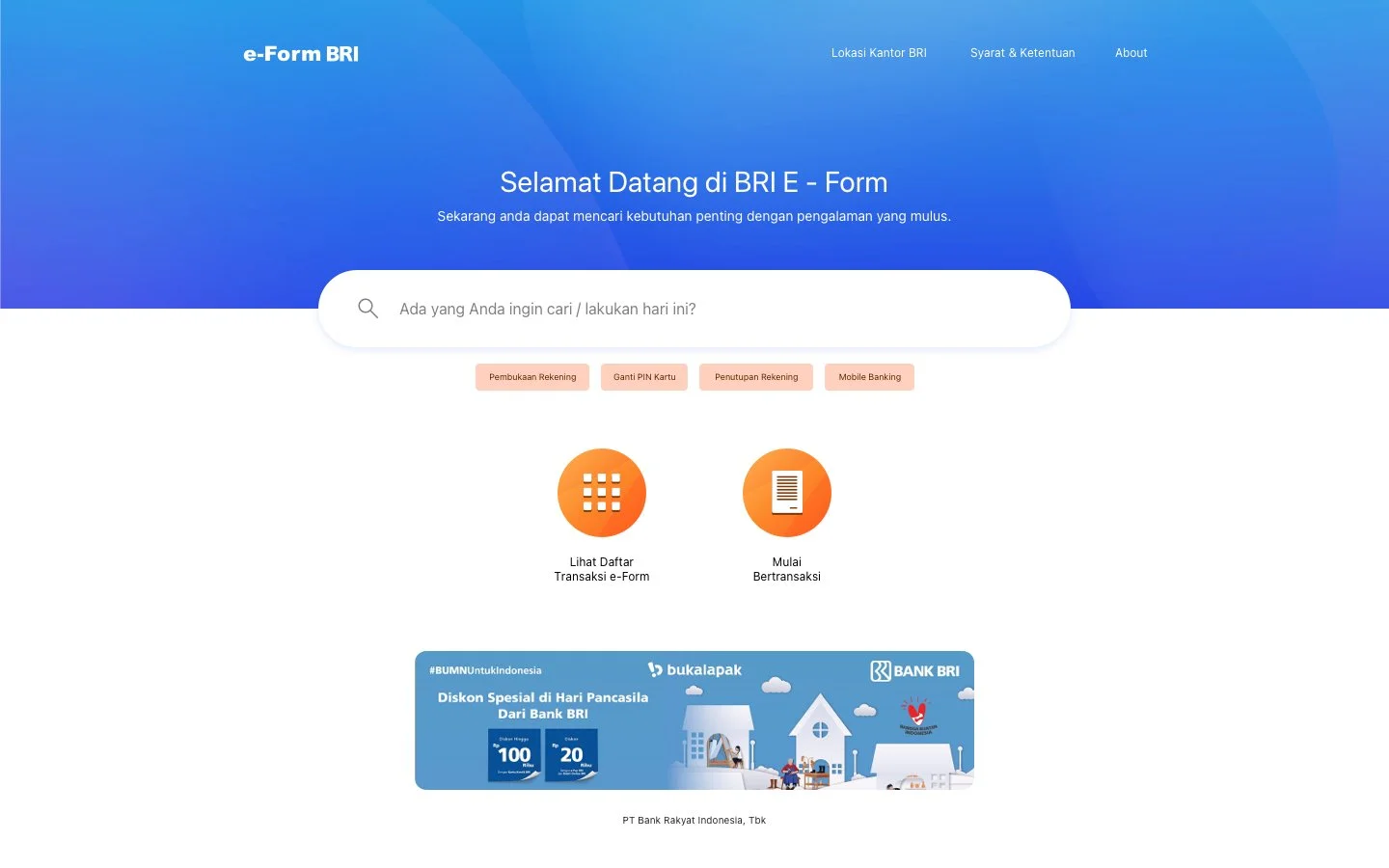
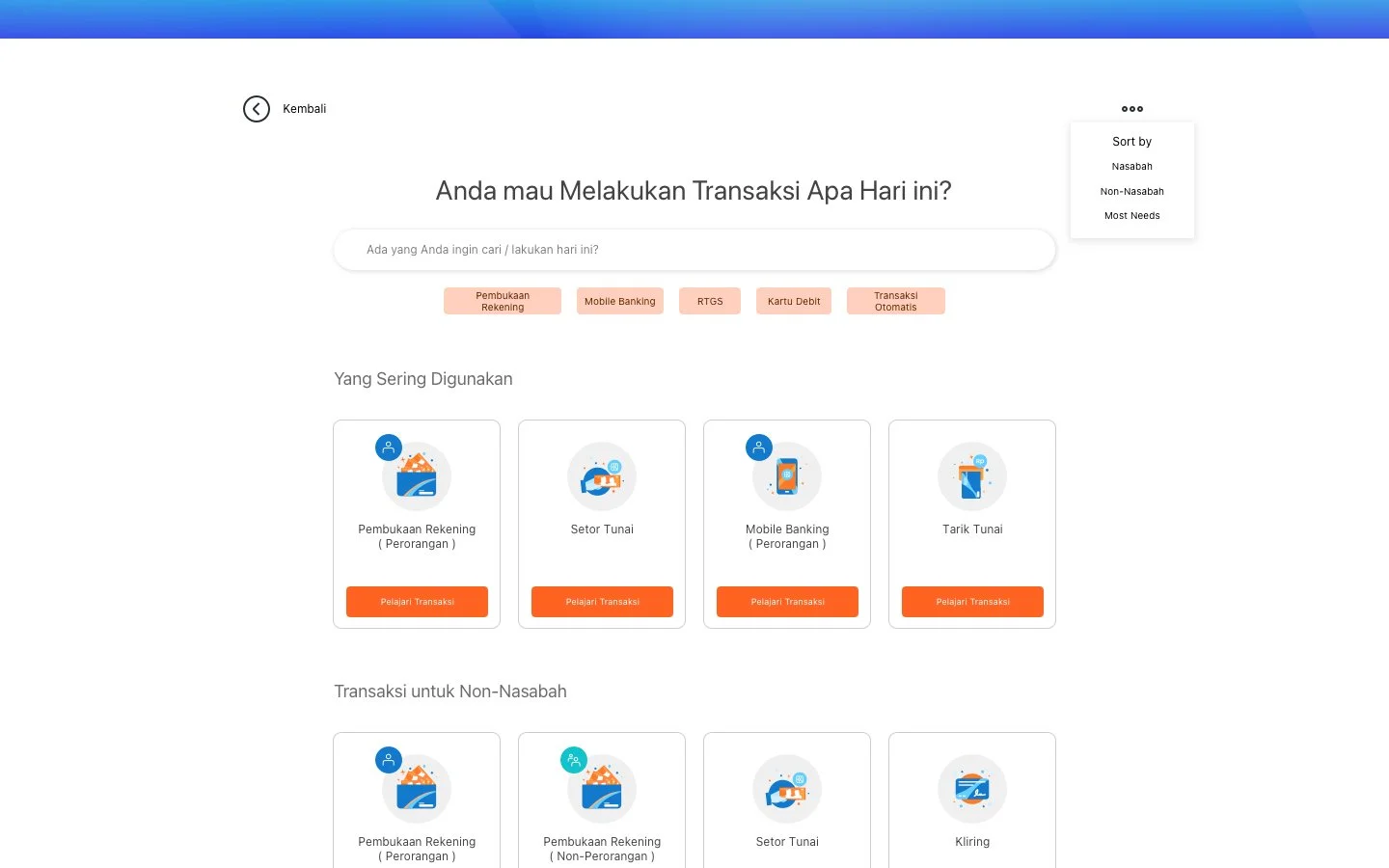
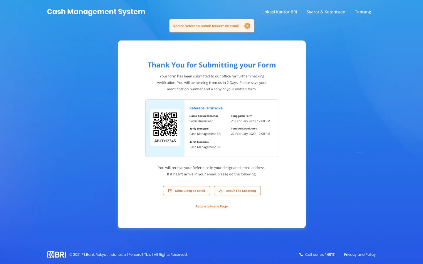
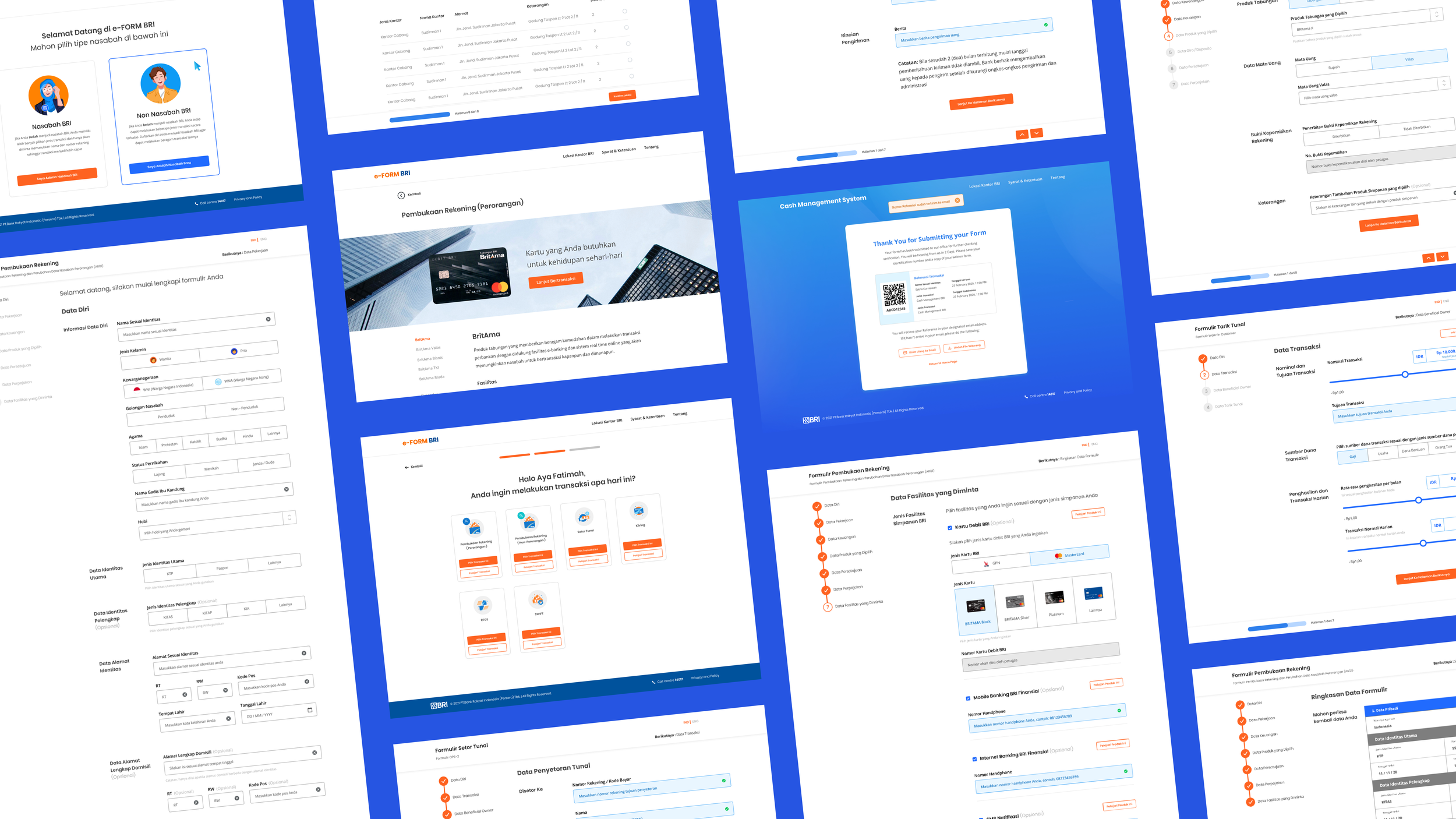
The new eform site design is now defined as a multi accessible bridging platform that helps customers to get the service that they require. The site is now packed with new features and experiences that aids customers in completing their form input. Improvements that has been implemented into the new site designs are:
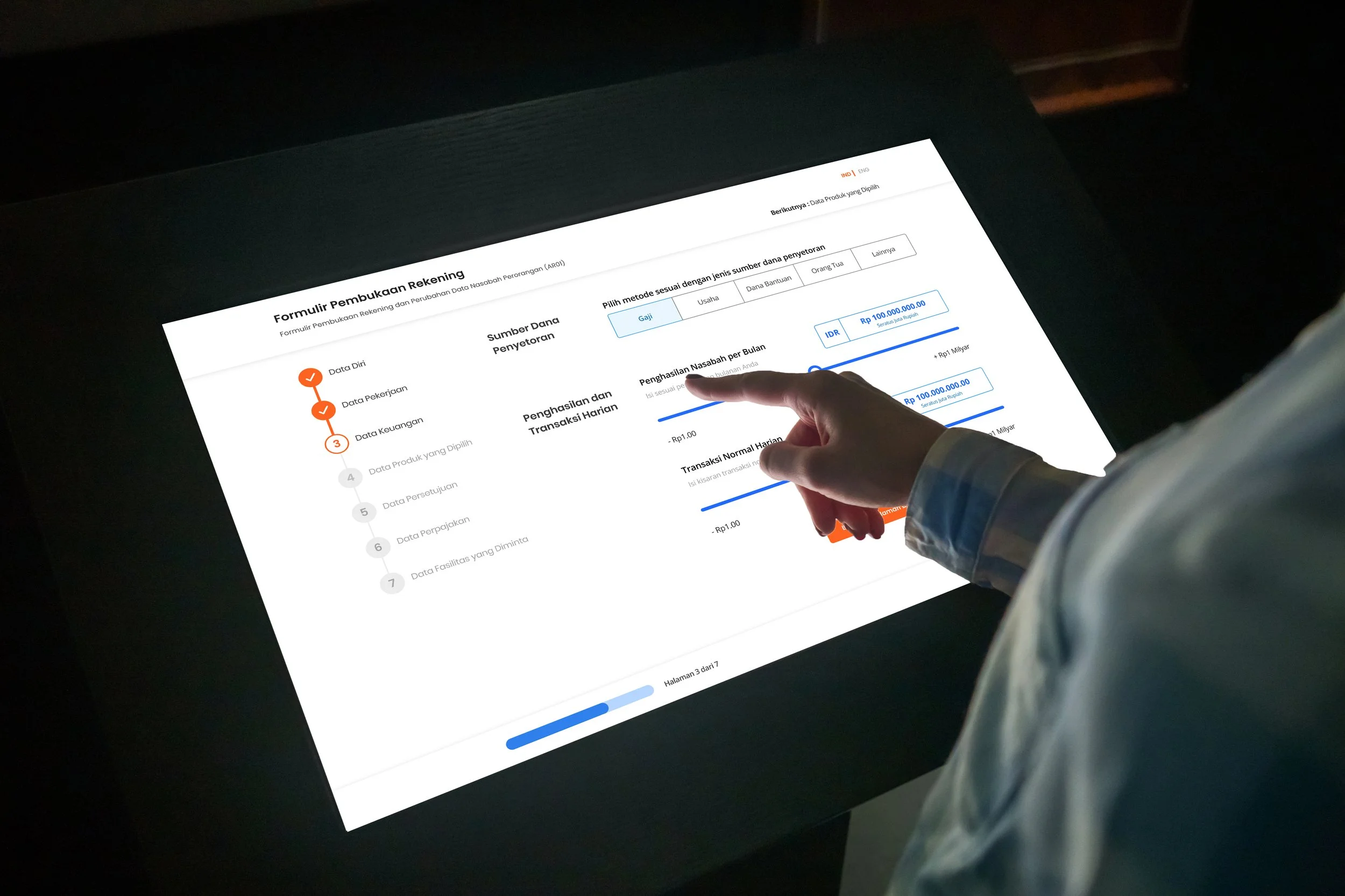
A. Progress Tracker in the form ensuring customers of how many steps they have left.
B. New and Existing Customer category differentiator for backend data record .
C. Simplified interaction for multiple choice requirements.
D. Freedom to choose any branches based on their current and nearest locations.
We designed the new eform site with mindfulness in prioritizing customers to read the content and instructions in detail through black text on a white background. Using BRI’s brand color for other elements that communicates trust and reliability. This eform site can be adaptable not only in public site but also applicable in touch kiosks in different branches.
The new eform site focuses on communicating to the customers as well and focuses on motivating them to complete their form input. We also improve the experience of filling the form by narrowing all content and making a quick interaction so that customers won’t feel it’s time consuming.
Results & Key Learnings
Although currently is under deployment, we managed to obtain a significant number of positive results when conducting our usability testing. We have gathered 8 customers in mix (4 Active BRI Customers and 4 Non BRI Customers) to find out how well did the new eform experience serves from starting to work on their task untill completing the task.
4 of the active BRI customers have all said the new eform experience is much more simpler to to use and navigate through since the physical form has been tedious to use. 3 of the customers still felt that its still too long and there are informations redudant being asked to them.
4 of the new potential customers have said that BRI’s new form experience serves better and much more detailed compare to other bank competitors. This shows that there is a probability of 80% chance of obtaining new customers to join BRI. With that being said, 2 of the customers have said that eform BRI still has the opportunity to be more simplified than before considering that new customers sees non bank firms have succeed creating a simpler experience.
In comparison, we have seen a 20% increase in productivity when filling their forms compare to filling in the physical form.
Next Step of Iteration
I consider this one has been the best for learning product development in an end to end process despite the obstacles and challenges that I’ve gone through. I’ve learned the fundamentals of a good UI and UX for form based designs, navigating through negotiation with stakeholders and finding ways to compromise decisions, and time management.
For the next phase of the iteration and development, the eform platform will be focusing on developing smart search engine, save form progress by sending link in email and cutting down textfields for optimized experience. We believe by implementing this features can increase user engagement by 30% more and avoiding drop off.


