Iterating the existing website to redefine its purpose and functionality by implementing better navigation and access that led to an increase in visit, traffic & conversion rate.
2018 - 2019
The main website has been the gate for customers and partners who wanted to open a BRI’s savings account as well as collaborating together to build something new for the future. Since its inception, the website has not been performing as expected in several areas such as its site visit, product purpose and system functionality. Since the website has not been concerned and overseen, the goal of this project is to establish a purpose of usage on how viewers would like to do and see when visiting the site.
Problem
BRI website hasn’t been maintained for over 10 years with a very minimal functionality and an outdated design. Because of this, the product has unclear goals with what outcome to generate; making us even more difficult to gather the right information. To make matters more difficult, we couldn’t identify the root of the actual problem since there are no proper traffic visit tracker and analytics tool being setup that would aid us to identify the performance in visits and access during the period. Additional problem arises when business divisions would like to include their content as well in the site but they would like to be unique and individualistic in their presentation.
Challenge
How to be Gov Bank’s #1 website with informative and trusted content that enables to capture new customers? The challenge here is to create simple navigation and localise language so that customers are able to understand the content being provided. Maintaining content consistency amongst business divisions within the website is also important considering the fact that they prioritize subjective personalisation rather than seamless and effectiveness. This is an opportunity building a solution that can be accessible anywhere in a limited environment, while maintaining regulations staying in BRI’s ethics and compliances delivering the outcome design in a short time
The MVP that we established as an area of focus are:
1. Easy navigation for users to learn and identify majority of BRI’s products
2. Informative and structural information with a clear Call to Action for next step
3. Consistency for product presentation and better management internally
Project Role
1. I had the opportunity to become a facilitator in conducting design thinking and usability testing for the project since this project we collaborated with a third party whose responsible for design and development
2. I’m a decision maker in managing all of design process and outputs, which means I have to aligned the requirement of stakeholders and making sure the design team delivers it on time.
Users & Audience
26 - 45 years old new and existing BRI customers, outside ventures or partners who are looking to join the BRI program and become an account holder in the company. For business ventures or partners who are looking to innovate and enter BRI’s market in new opportunistic landscape
Design Principles
My principles have always been: Customer first, Storytelling, Impactful and Simple. The product needs to be customer first minded catering to their needs. The product needs to connect users through a story they can relate to. The product needs to be impactful for both users and the business. The product needs to be simple enough to use for longetivity.
First Web Design
Second Web Design
Research
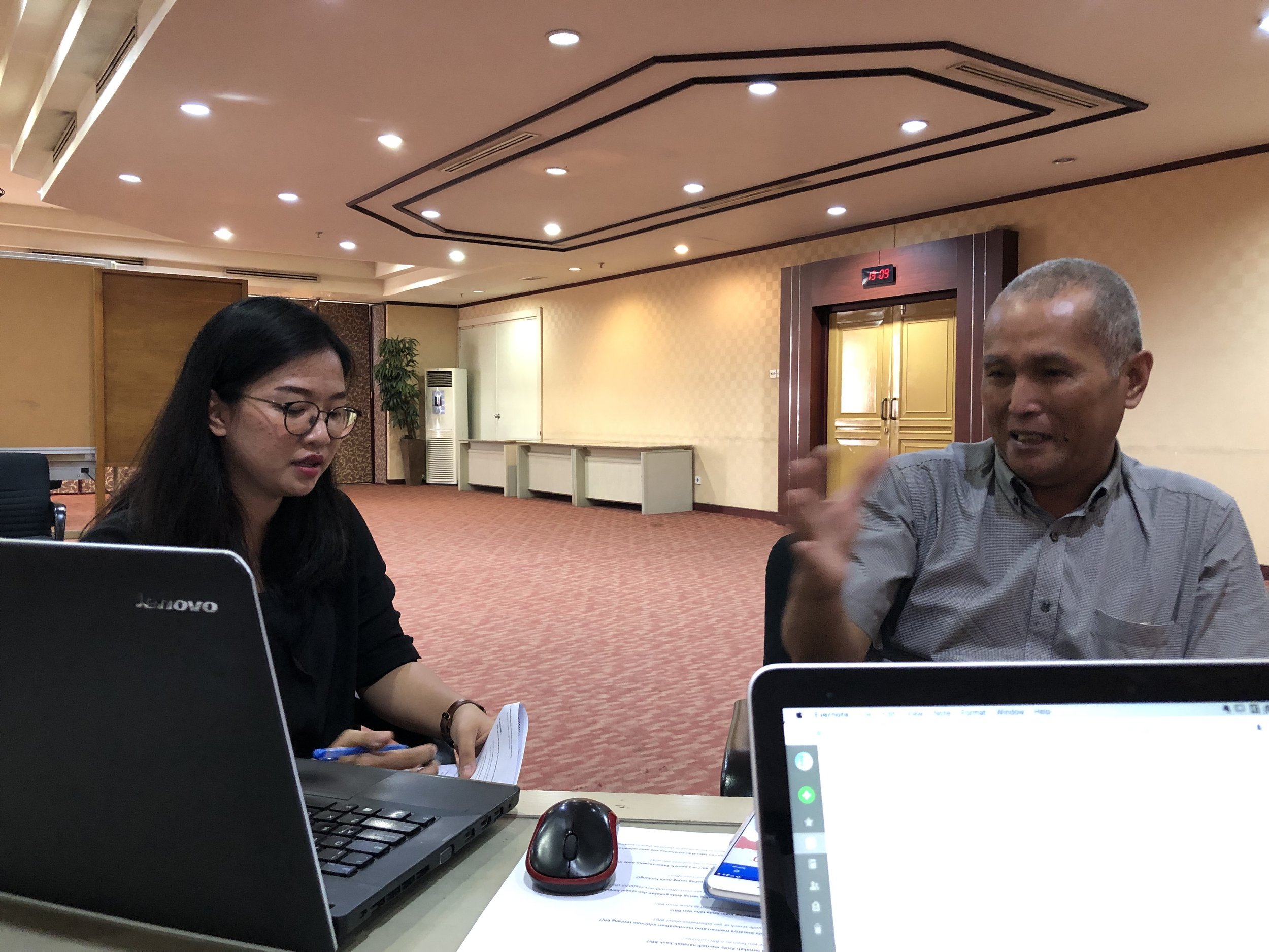
We first conducted Research by helding a one on one interview to gain insights from different customer segments. We travelled to different cities and getting insights from customers to current BRI employees by obtaining insights that would help improve the product. Other than conducting the research in Jakarta, we travelled to Surabaya because is the second biggest number of visitors to the product other than Jakarta.
One of the things that we looked at is the first design and second iteration of the website. After conducting our research we tried to look at if the results that we’ve obtained matched with the early iterations of the design. Although in comparison both of the designs are different, the second iteration has vastly improved in terms of adding important features that users require and able to compete with other banking websites in Indonesia. However, despite the improvements, there are other areas that still remains as a problem and that it requires attention to improve
Ideation
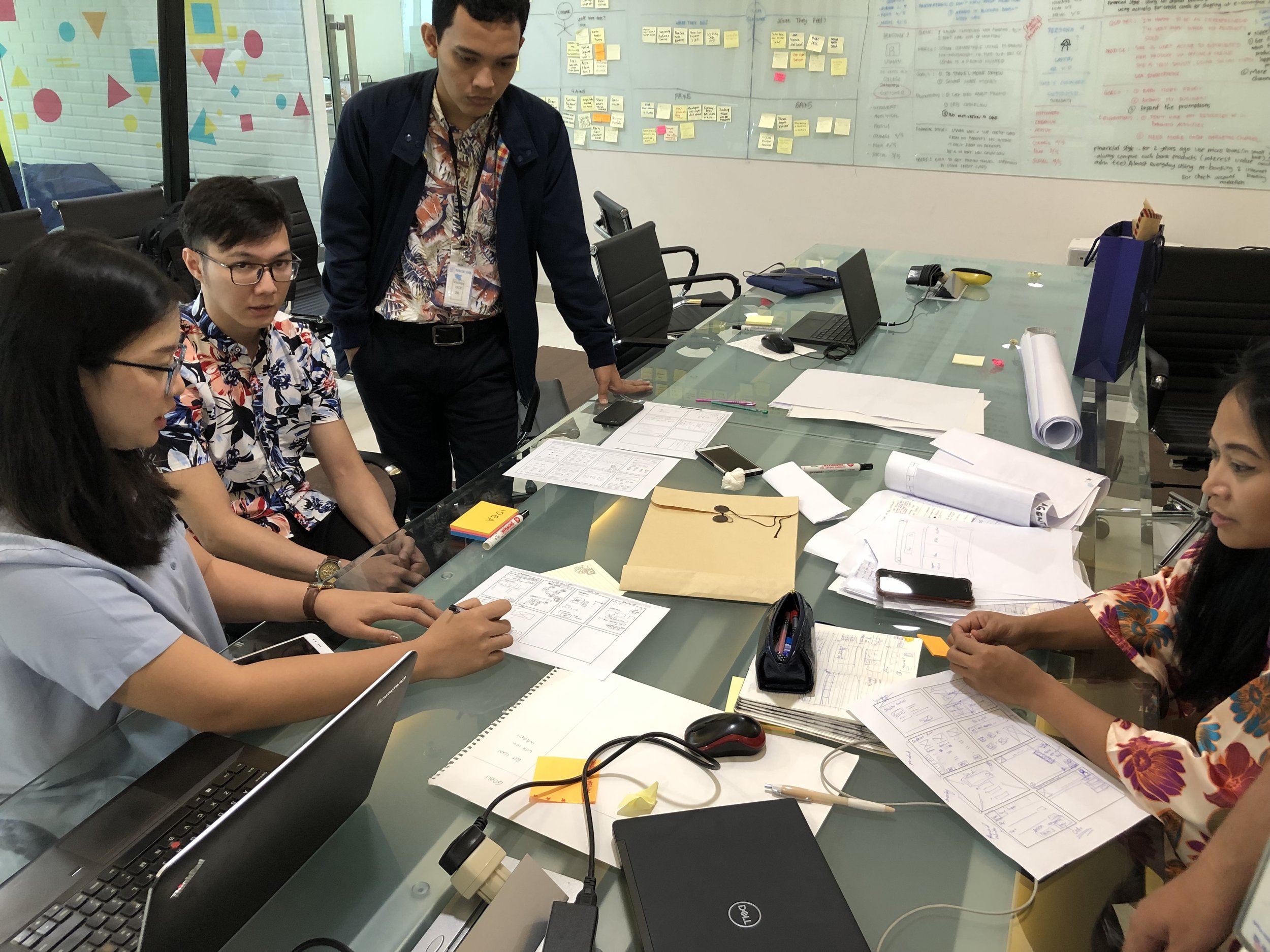
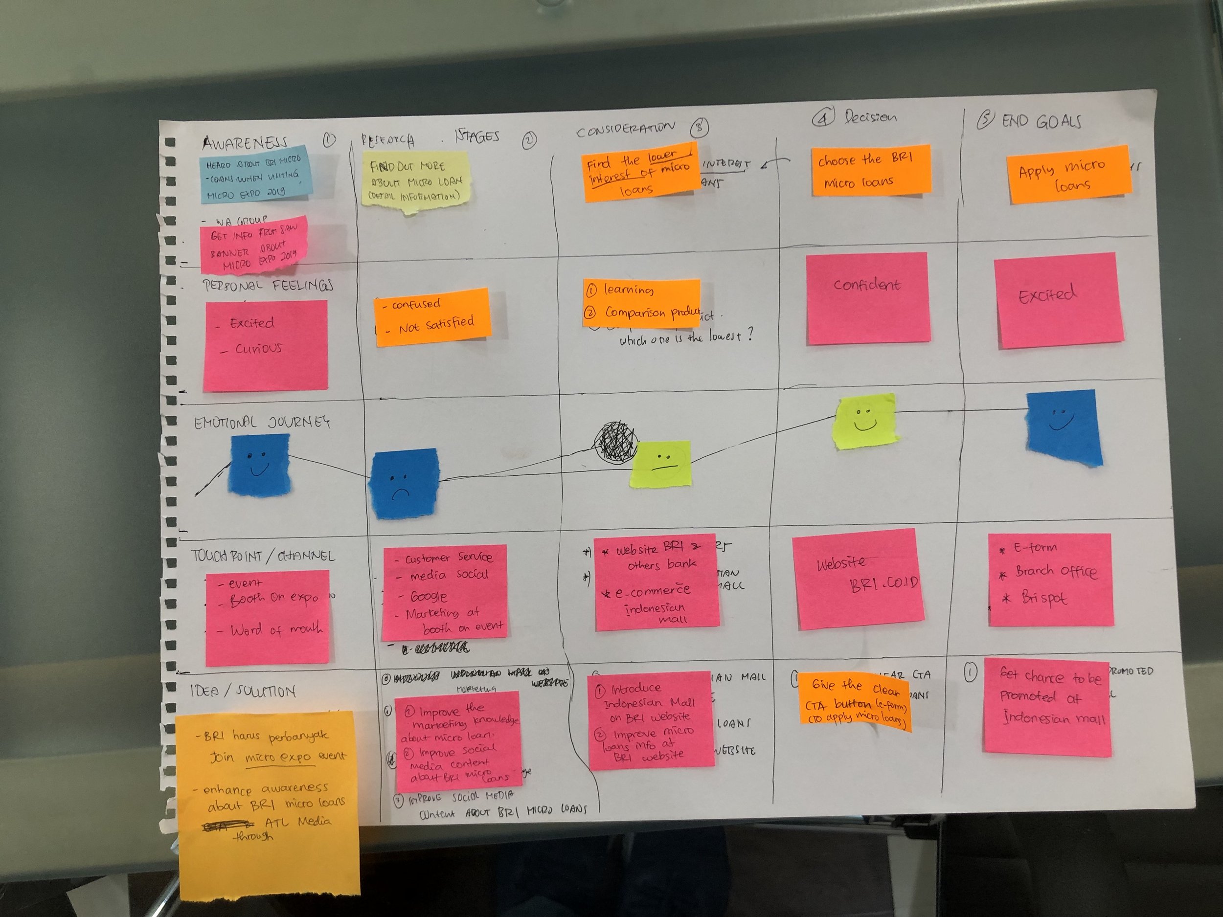
We performed a 2 day design thinking to narrow down our results and focusing more on what it needs to be delivered. During the sessions, we produced How Might We Ideations, Customer Journey Map and Prioritisation Matrix as a guide on what should be executed next.
We chose to use different frameworks for the 2 day design thinking session is because we wanted to make sure we cover all the necessary needs of BRI and users who are going to acess the site.
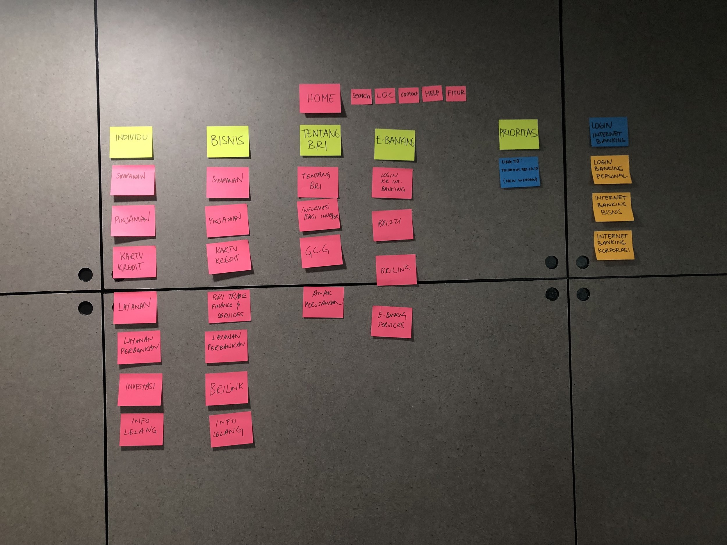
We also did information and navigation architecture exercise because it was one of the primary task we needed to conduct. One of the areas of improvements that requires in the site is an organized navigation menu. BRI has lots of products and with lots of users visiting through the site, we need an extensive look on how might users navigate easily in the site.
The challenge here is categorization because most of the divisions have different ways of perceiving things and taking things also into account. We also believed that focusing on navigation can help us expand more of the branches.
We also wanted to learn from their behavior through customer journey mapping where we want to know where the existing pain points exist, how can we solve it with design, are we able to cut it back and how might we use some stages to an opportunity to capture the audience.
Through design thinking, we have a better understanding on what customers expect and how business can provide that by framing through these activities. Design thinking for this project allows us to make decisions faster and optimized since the scope of this website is at a large scale. Because there were lots of expectations coming from stakeholders, the design thinking also supports as evidence and process documents so that when we present the final result, design thinking allows us to explain the thinking process on the final work. During this time in BRI, the pattern has always been straight to design without dissecting the actual needs and goals of users therefore the challenge of prioritise which features goes first has been tedious without any support of evidence.
Design Process
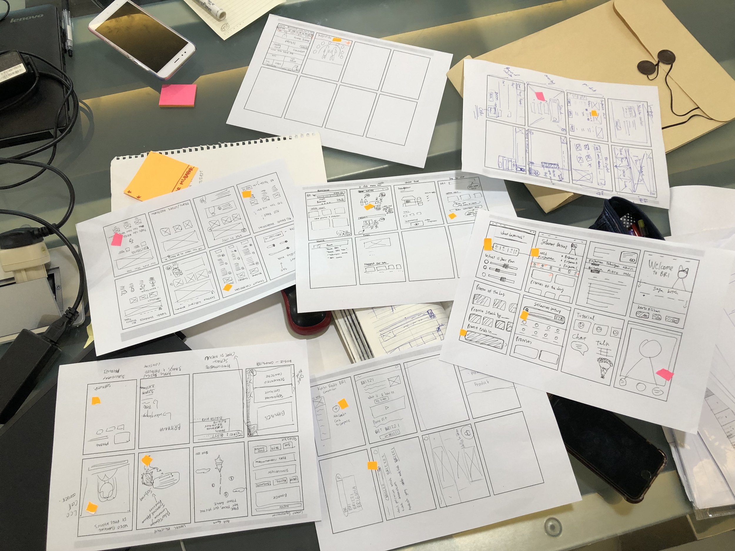
Afterwards, we then continue to Crazy 8’s and Prototyping on several explorations for the homepage and the information architecture of the product. In this session, I guide and oversee a junior designer who are tasked to execute the design as I require them to make sure it answers all the problems we laid out in the beginning. We did voting altogether in this sketching process to decide what features or sections we should prioritize first and how the design should look like.
Usability Testing
We then proceed to conduct Usability Testing to investigate if the solutions have indeed solved the user and business needs before development. During this time, we conducted tests to 5 participants for onboarding, navigation and accessibility to pages. The features that was going to be a focus was the search engine, navigation and content organization because these are the most concerned areas the users would like to be resolved. We’ve learned through the testing, users felt relieved that the new site is properly laid out. They are able to locate the products easily and conveniently with ease of mind. Participants also feel that searching for BRI products are more detailed because of a dedicated search interface and that they can adjust their filtering if they wanted to look for something.
Final Design
The new iteration of the BRI website is a functionally purposed website with specific attention to both user and business needs. Since the original goal is to solve a lack of product purpose problem, we sought out to improve and design based on the user’s specific needs which are having the website to focus on its search engine and navigation information structure. In the final design of the iteration, the structure also changes to fit the needs of users. The primary features that were on display are head banners, search engine, promos, money rate and loan simulation. We believe that by focusing on these features in the primary website will hopefully draw attention and gives users more reason to engage with the site other than just looking for information for any types of product being offered by BRI.
Results & Key Learnings
We have obtained two different results from two different occassions. The first result was from usability testing, where we discovered that from 5 participants that we recruited have claimed that they are able to find the informations they need because of the improved product categorisation and better information layout. This shows from the previous design, there is an increase in 50% in completing the task. Overall have said that all pieces of information have been perfectly placed and presented even though it still feels too much and too long to scroll. From this project, we also managed to snatch the Web Awards for Bank Standard of Excellence as part of the transformation and iteration that occurred for BRI.
During the first couple of months, we have seen a high increase in the website visit estimating bout 50% compare than before which has a very low number in the previous design. However, the real key takeaways are after deployment. What’s interesting that happened after a year from being deployed, we found out there is an increase in drop rate about 50% between entering and exiting the homepage. This means that majority of the users did not bother to go further into the website to find the information they are looking for. Through this project, the lessons that I get is I should’ve refocused on the main goal and task of the website’s functionality because as it turns out, being just an informative website wont help the business achieve its goals. The next action for improvement is narrowing down the main goal of what to achieve in the website and simplifying the content in the website by conducting a heuristic evaluation with customers.


