Redesigning Ceria by BRI Credit Apply journey that led to improve 20% conversion increase
2020 - 2022
Ceria by BRI is the Gov Bank’s first paylater app that was catered for consumptive behaviour customers who enjoys shopping for primary, secondary and tertiary needs. Since its deployment, we have seen a high number in drop rate during applying for credit limit. From this problem, we wanted to investigate cause of issues with goal in mind to improve by redesigning the experience and bringing an updated look to improve usability, pivoting and better metrics analysis.
Problem
After the initial deployment of the product, customers have faced issues when applying for their credit limit. In the span for over a year, we’ve seen a massive drop rate at about 70% where customers have decided to not continue apply for limit credit. Consequently, the product team needed to figure out how to improve the experience of applying for limit credit both in design and development.
Challenge
How to create a seamless, faster and detailed user journey without compromising the backend system. Timeline is our biggest obstacle as we require to revamp the new user journey in due time in order to avoid the number increases its drop off completely, considering also that Ceria faces fraud issue in 2020.
The MVP that we established as an area of focus are:
A. Informative step by step to ensure assurance for users to continue applying.
B. Recognizable user interface for faster response and process while applying for credit limit.
C. Clear illustration to communicate brand language of the product.
Project Role
1. Becoming design lead for the revamp version, Focusing on UI crafting and facilitator for lightning decision jams and usability testing
2. Designed the first concept for the moonshot app
3. Supporting in research, prototyping and design thinking initiatives from collaborating with market, development and design vendors
Users & Audience
The are two types of customers which Ceria aims for since its deployment and product iteration. These personas are:
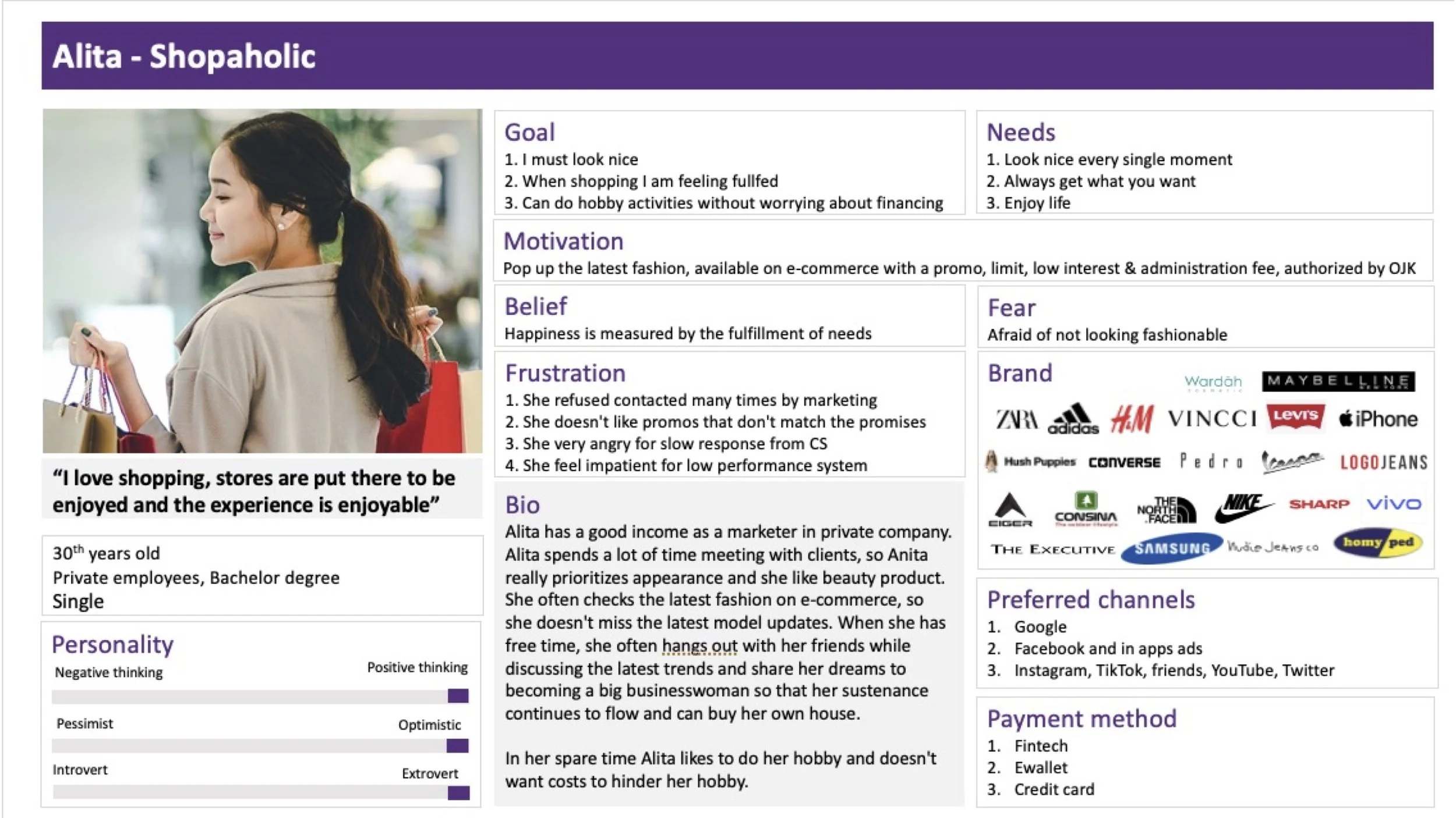
A. Shopaholic: 28 - 35 years old young mature men and women who are passionate active workers, enjoys splurging their money for self-gratification, life fulfillment and dream chasers.
B. Economize: 28 - 35 years old middle age men and women who prioritize their families more than anything. Unselfished and essentials drive who needs things to survive.
Design Principles
My principles have always been: Customer first, Storytelling, Impactful and Simple. The product needs to be customer first minded catering to their needs. The product needs to connect users through a story they can relate to. The product needs to be impactful for both users and the business. The product needs to be simple enough to use for longetivity.
Heuristic Evaluation
We first look back at our existing application and how did it perform so far over a year and in this method of working is focusing more on evaluating the current state of the product from design and performance. This step is important for any iteration because this is where “self-reflection" comes in, where we can finally identify what went wrong.
The evaluation that was focused on is the UI and basic theoretical experiences because we wanted to know if there are any interfaces affect the communication and experience of the product. It turns out users don’t have the right control of freedom when applying for limit credit and users are unable to recognize error states and descriptions that confuses them.
The design was considered inconsistent and there is no standardization to how the brand images and user interfaces should be lay out. The apply also became inflexible and inefficient because of all the data forms they require to input and users aren’t given a constructive information for them to deal with unnecessary errors.
In depth Research
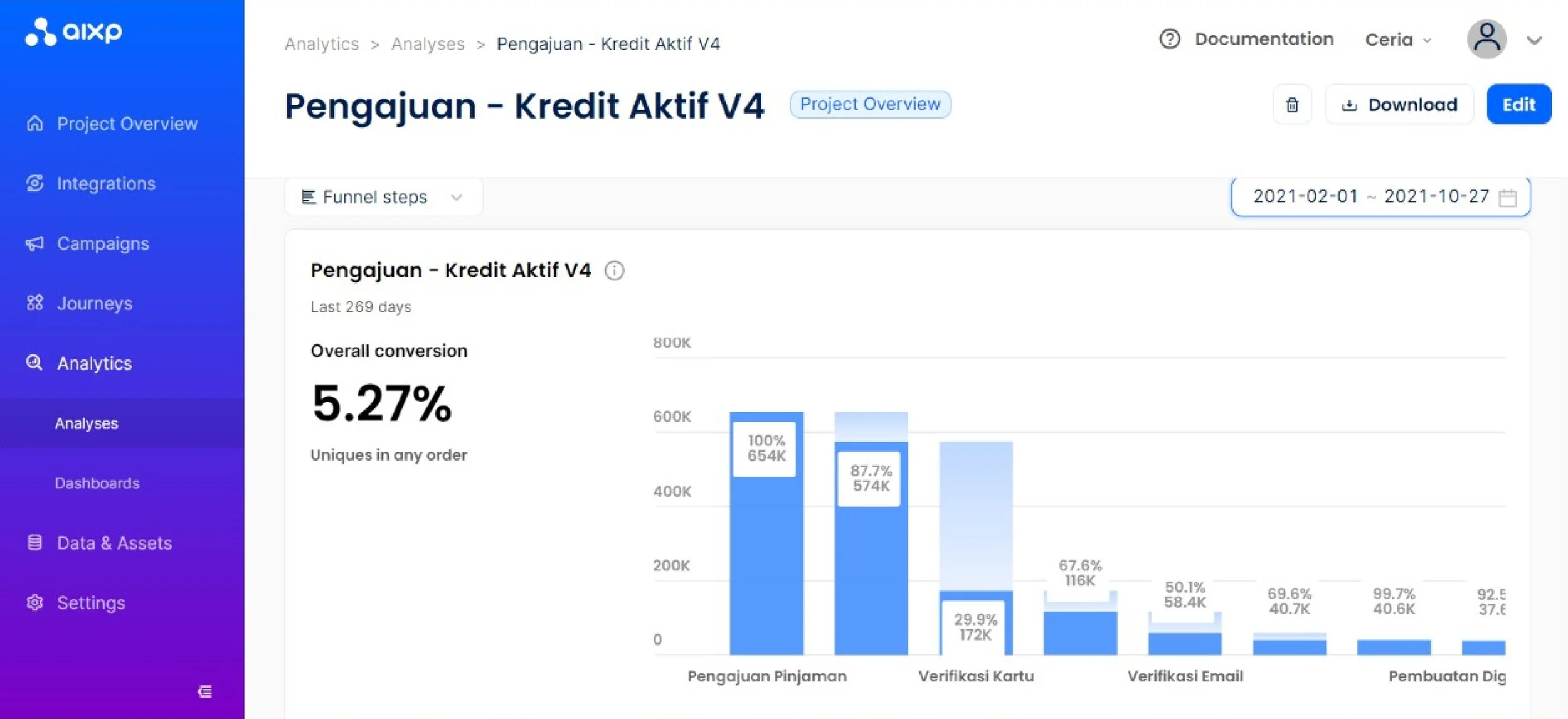
We also discussed and analyzed the conversion data and google play store reviews we have obtained for the last years. Based on the datas that was shown early, it turns out that our hypothesis and assumption that customers faces difficulties are located in the specified area of customers verification and email verification. Our first initial thought is that it was affected by at least 60% from the system performance. Now this leads us for designers on how might we are able to improve the experience through design and we can prevent this to avoid drop off rate at about 20%.
First Usability Testing
After heuristic evaluation is complete, we proceed to conduct usability testing on the existing version of Ceria to get more in depth feedbacks form customers who have been using the application. We have gathered 6 participants whom all are BRI customers with different backgrounds ranging from students, young workers, early married couples and entrepreneurs who wanted to use Ceria as their new payment method. During this session, we prepared three different sets of experience test plans where onboarding and apply is through the live app and the payment through paying the installments are from prototype in order to avoid users from actually purchasing a real item.
“ Ceria gives hope to people who aren’t capable of affording. When I got my money, I felt my life is fulfilled and I’m able to get the things I wanted. ”
In this first usability testing session, we’ve learned new major insights in the app and the person as well; these are listed:
1. During the test Applying for credit limit, we noticed that one of the main reasons why there is a huge drop off in the email verification part was because of a faulty system / server as well as the design journey of the email verification part was not communicative and it made users felt trapped in the state of screen with no next call to action and enrages users to continue.
2. During the test Onboarding, customers have shared to us that they felt having two screens to indicate login and signup confuses at first because they both look the same and they get confused on which state they should be entering
3. During the test for filling in form, customers faces difficulties in ID verification where the background check if customers are eligible to apply, they were informed that they cannot continue because they are not whitelisted or meet the requirements. Further investigation suggests that customers were not properly informed about why they are unable to continue in the application process.
4. During the test Applying for credit limit, customers voiced out that making selfie and face verification twice and in two different places causes a major confusion and adding extra effort for customers to go through while also potentially creating a big risk for the bank since there are fraudsters who will likely to experiment and breakthrough.
5. Overall, customers gave their feedback in the use of visual colors and design in the application where they mention that because there is no BRI logo, it is hard for them to gain trust if the product is safe in the long term and it won’t be able to attract non BRI customers. Also, the use of icons and illustrations did not engage and made customers feel they belong.
Through this first usability testing session, we are able to obtain important feedbacks as it turns out customers faces issues not only in the design but also from the bank’s system/server that requires maintenance. But the most valuable lesson in this session is that we finally got a better understanding and in depth look on how our customers actually behave and navigate through the application. What we initially thought is now different when we saw how the responded and from this lesson, it helps us to prepare what to improvements we need to focus on.
Ideation
We then continued to derive the insights through a 1 week workshop with other business and development divisions that contributed on Ceria. In order to validate and strengthen the goal of improvements, here is what we have decided to work based on the workshop’s result:
1. The Ceria team will now divided into four streams (tribes) and its consisted of Growth/Acquisition, Application, Transactions/Collections.
2. Establishing a prioritization metrics from the application stream to focus and narrow down the most important features or areas that require improvements from both development and design part.
3. The design team will formulate framework documentations in order to build a foundation in order to provide direction on the design and iteration of the product.
Prioritization Metrics
During the workshop session, I was assigned in the application stream to discuss with other business divisions and business owner to identify what are the problems that currently occurred in Ceria whether based upon UT results or from each personal experiences. After we have all decided together as a team, we have concluded the list of tasks the team are going to focus at within the four quarters. However, the priority that we wanted to make sure that is delivered first are Email verification, Improved OCR Identity and selfie scan, simplified applying for credit limit and defined complaint handling.
Competitor Analysis
We then continued to build competitors analysis to identify pros and cons of Ceria compared to other digital lendings out there. Our competitors that we focused are Kredivo, Indodana and Akulaku because three of them are able to capture new customers consistently and these are the only apps that has less issues when it comes to apply for credit limit and making transactions with merchants. Firstly, although there are major differences between the competitors, Ceria’s main advantage is that it shows trust and security as well as it promotes 1.27% of interest rate. Other than this, Ceria is missing opportunities in shorter journey of applying credit limit, more organized content, diverse promos from more merchants, informational content in support and FAQ and a simpler way to track spendings and make payment. From here, our insights are validated through the analysis and it gave us a clearer direction on what needs to work on.
Persona Mapping
The next phase we conducted is redefining Ceria’s persona map in order for us to get a better understanding of who is our customers now since our previous hypothesis customers are based on early research. The reason why we are creating an updated version of persona map is we are unsure of who should Ceria serve primarily as well as how might their behaviour impacted on the experience of using the product. After conducting a separate research to gain insights of our potential customers, we have concluded that our primary users that we need to focus are a mix of customers who enjoyed spending their money and who buys essentials for their families. This means that the new iteration of the design should cater both by providing a fast apply process for urgency while also being instructive and informative ensuring customers are careful.
Design
After the ideation process is completed, we continue to our next step in design planning:
1. Based on Google Play store reviews, Heuristic evaluation, AIXP funnel and Usability testing, we need to focus on designing for onboarding and applying features as the goal is to improve and retain conversion rate.
2. Based on the competitive analysis results, we need to develop a new user journey for the iteration version. This user journey will help and guide us to form the design
3. Based on the person mapping results, we need to establish a new visual identity consist of updated iconography, illustrations and typography.
User Journey
We finally mapped out the existing version and improved upon that on the second iteration where we are able to see the difference in the current and new journey. Based on two comparisons of the journeys, we have analyzed that we have cut down 6 major steps in the first version and simplified them into other states of the screens. Not only that, we have also managed to minimize the number of input fields from 30 to 16 for a better optimized experience. However, the only difference between the existing and new journey is that we had to change the mechanism of email verification in order to support the goal of creating a better constructive steps in applying for credit limit.
Exploration Sketches & Wireframing
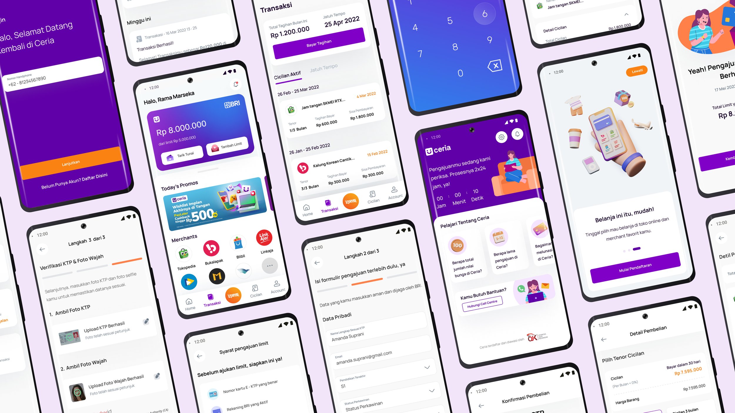
For this new design we wanted to make sure the new look doesn’t stray too much from the existing design by retaining the layout, visual language and some of the user interfaces. In this new look, we wanted to ensure that future customers are able to understand and navigate better through the support of new information structure and possibly visual images. We explored primarily for the most important states of the screens and those are: Application Form (including customer and Identity identification), Email Verification and Home screen as the most critical states that requires attention.
Low Fidelity Wireframing
Visual Imagery Explorations
In order to support the refresh UI look of the product, we need to improve upon the visual language as well. We collaborated with a design and craft expert vendor called Paperpillar where they supported by providing the final version of coloring, illustrations, iconography and some interfaces that requires improvements. While they focused on delivering the final version, we provide and gave the art direction for the team in order for them to get an overall picture or visual of how the product Ceria will visually look like.
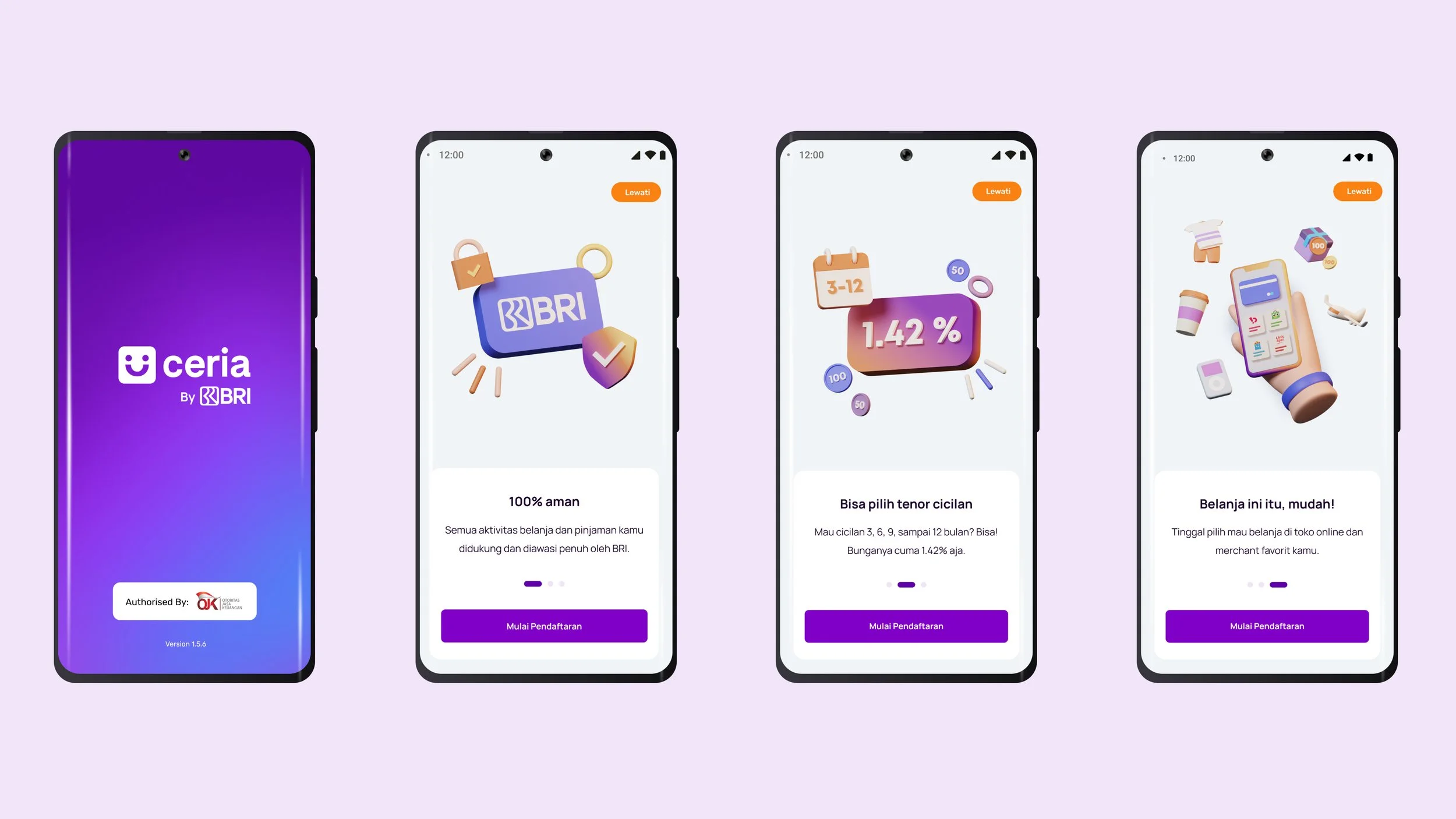
Our new direction for the refreshed look improves trust by implementing more BRI blue to the main color of Ceria since most customer feedbacks suggest that without indicating BRI, Ceria will just be another random lending product. We also create new illustrations of objects and human characters that will help communicate information and error handling deliveries to new users so they are able to understand the context better. The reason for this illustration direction is to represent the customer groups of Ceria ranging from young milenial workers to middle age entrepreneurs which the product is targeting for. We hope to create a refreshed look that allows the product to communicate and represent the customers better.
Usability & Concept Testing
Once the prototype has been designed, we immediately conduct usability and concept testing in parallel. For existing customers, we conducted concept testing and for new customers, we conducted usability testing. The difference of the methodology is we wanted to study and obtain insights in depth for newer customers because we want to know if we are able to capture them to register both in BRI and Ceria since currently Ceria is only applicable for BRI customers. We also wanted to gain a newer perspective from customers who uses Ceria’s competition and get a comparison on how much the design that we revamped is improved or does it require for further study.
Whereas for our concept testing we wanted to measure the success and speed of customers if they are able to accomplish applying. For this test, we focused with existing customers who are rejected when they apply. Since their memory of remembering the existing’s journey is short, we wanted to get an insight from them to see if they are able to apply faster and potentially prevent them from being dropped off.
Challenger User Journey
Minor Improved Existing User Journey
During both of our concept and usability testing, we have discovered new insights that is helpful to our revamp:
A. Customers prefer the integration of BRI brand color and a logo of BRI near Ceria to show and illustrate that this product is owned by BRI in order to promote trust and security.
B. During concept testing, we used a standard vs challenger journey where the challenger is a major improved design that offers optimization and seamless without compromising the system development (combining all the separate states as mentioned in ideation). It turns out, customers are able to apply faster and understood easier in the challenger journey, enabling them to save time and effort.
C. During usability testing, the customers pointed out that the use of illustration aids them to understand the information better, however requires them to be consistent.
D. Customers mentioned that its better to have a shorter form requirement and ID verification process altogether with OCR selfie to give better flexibility and putting heavy effort early on.
E. The manual initiate email verification improves upon information instruction and gives customers a clear direction on what to do next. The previous design didn’t help customers head to email to accept limit offer, but when we motivate them to take action, that’s when they perform better.
Final Design
The new Ceria by BRI iteration is an improvement from previous design where this version is more informative, seamless and faster for customers to apply credit limit. It also supports a new fresh look to embrace the product’s personality and essence in order to improve its marketing strategy as well. The iteration has now improved from 5 application process into just 3 simple steps in order to reach credit scoring. It also improves on how the home screen will function across the application by serving as a step recounter so when users are lost or got into an error, the improved home will help customer navigate back into applying the credit limit. Finally the new iteration uses a more descriptive and detailed iconography and illustration that improves content showcase and better descriptions.
Results & Key Learnings
From what I can share, although it’s currently under development; the redesign of applying for credit limit has shown a major improvement after conducting numerous Usability Testings. 90% of the users who tried to apply with the new user journey has said that its much faster, simpler and doesn’t distract the users who are focusing on applying.
We timed the current new experience with the existing and based on the prototype, we see users have approximately saved around 3 minutes of their time before credit scoring. Although in real case would be different once they approach credit scoring since it takes 1 - 2 days, but by looking at the prototype this shows that users are more willing to apply than to stop.
By looking at the email verification steps, in the prototype users are able to navigate and understand the clear instructions and states of where to accept their limit offer. This shows that there is a possibility of improving by 20% users will be able to successfully open their email and accept the limit offer.
In this project, I’ve had the opportunity to learn new experience from conducting tests and leading the design team to iterate the application. My biggest takeaway is always stay patient when conducting tests and made iterations because sometimes we need to provide strong reasonings and evidence to make improvements since we need to consider business owners and product owner needs. Since this is my first experience in implementing iteration in a design sprint scheme, I’ve learned to manage time and expectation where we can start from something simple to investigate and make improvements. Although this project takes a lot of time in design and development, I realize that sometimes starting small can also be effective without trying to go through the process holistically.
What’s the Next Step?
The iteration doesn’t stop there since during this iteration process, we have conducted a reimagine experience in parallel after the workshop after prioritizing on what needs to be improved. During our reimagine session, we have came up with several ideas that focuses on personalization, transparency and engagement. Ideas that can potentially be worked on are Limit Tiering, QR Payment, Personal Recommendation and Credit Limit Split Organizer. Since digital lending products require continuous customer activity within the application, the next focus should be on marketing content support for Ceria.


